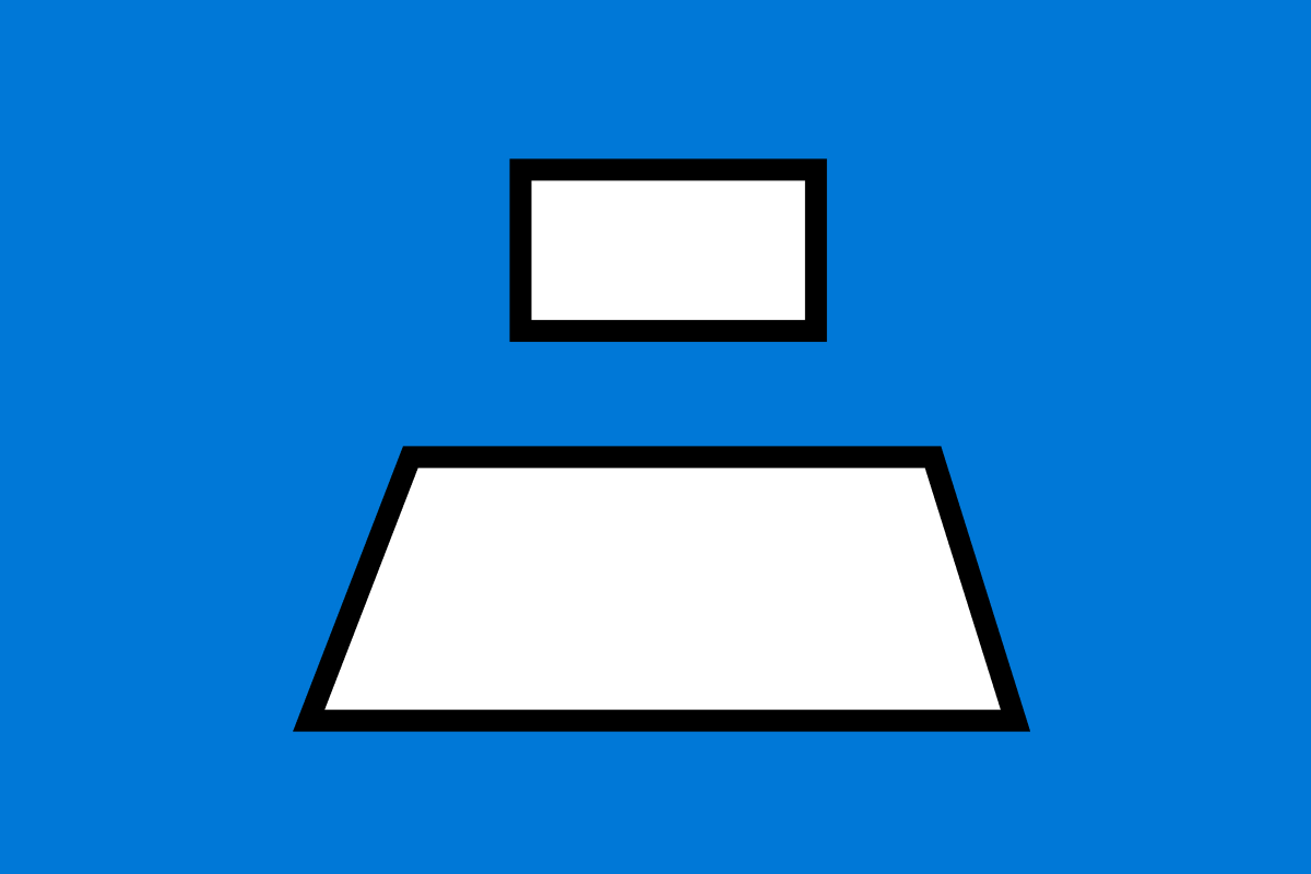
Our client envisioned the set up to be comprised of two screens. The smaller top screen acts as a viewfinder into a world of holograms while the second larger screen at the base would be use to control the top.
Microsoft wanted an experience that showcased and educated people on HoloLens. HoloLens is an untethered device that straps to your head, it allows people to see and interact with holograms. The experience was displayed in the Microsoft Stores across the states.
On the team at Ten Gun Design for this project was:
an Art director, another designer, a developer and myself.
UX / UI Designer

Our client envisioned the set up to be comprised of two screens. The smaller top screen acts as a viewfinder into a world of holograms while the second larger screen at the base would be use to control the top.
IDEATION AND FLOW
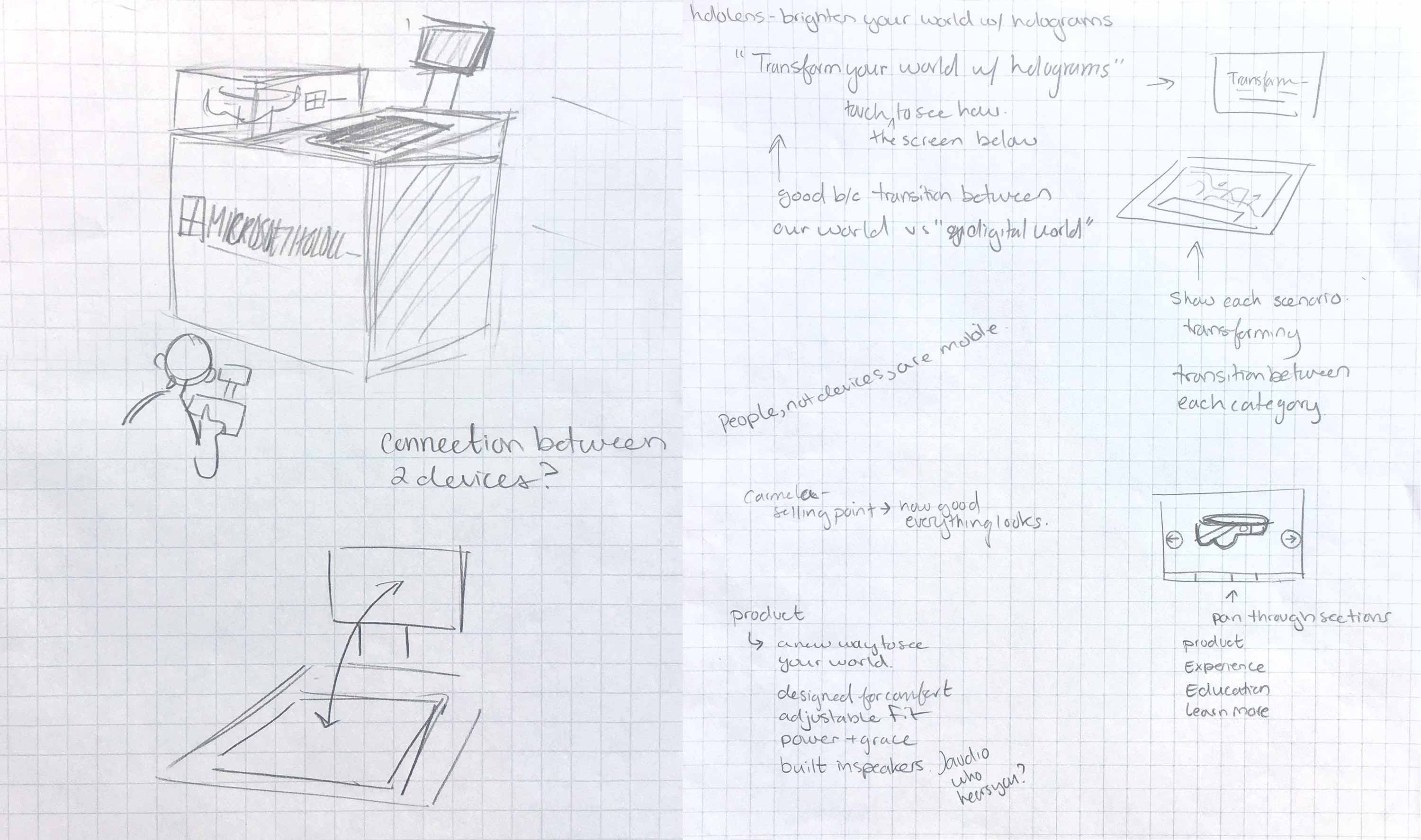
I sketched out how I imaged the area being situated for the experience to get a better sense of how someone would walk up and touch the kiosk.
While working on the flow of the experience, I started having concerns about the use of the top screen- when I work on creating flows, I take a general inventory of assets available to use. It would not be possible to create a first person experience without making completely new assets, our timeline did not allow for this.
Since I had didn’t have visual content for the top that aligned to our original goals, I felt it wouldn’t be ideal to have someone interact with the bottom screen to learn more about the hardware and then have them look up to a much smaller screen to watch a short video.
I wanted the person to play mostly with the larger screen and only look up if they needed to, I designed the secondary screen to contain supplemental text that changes according to what you’re looking at.
Testing
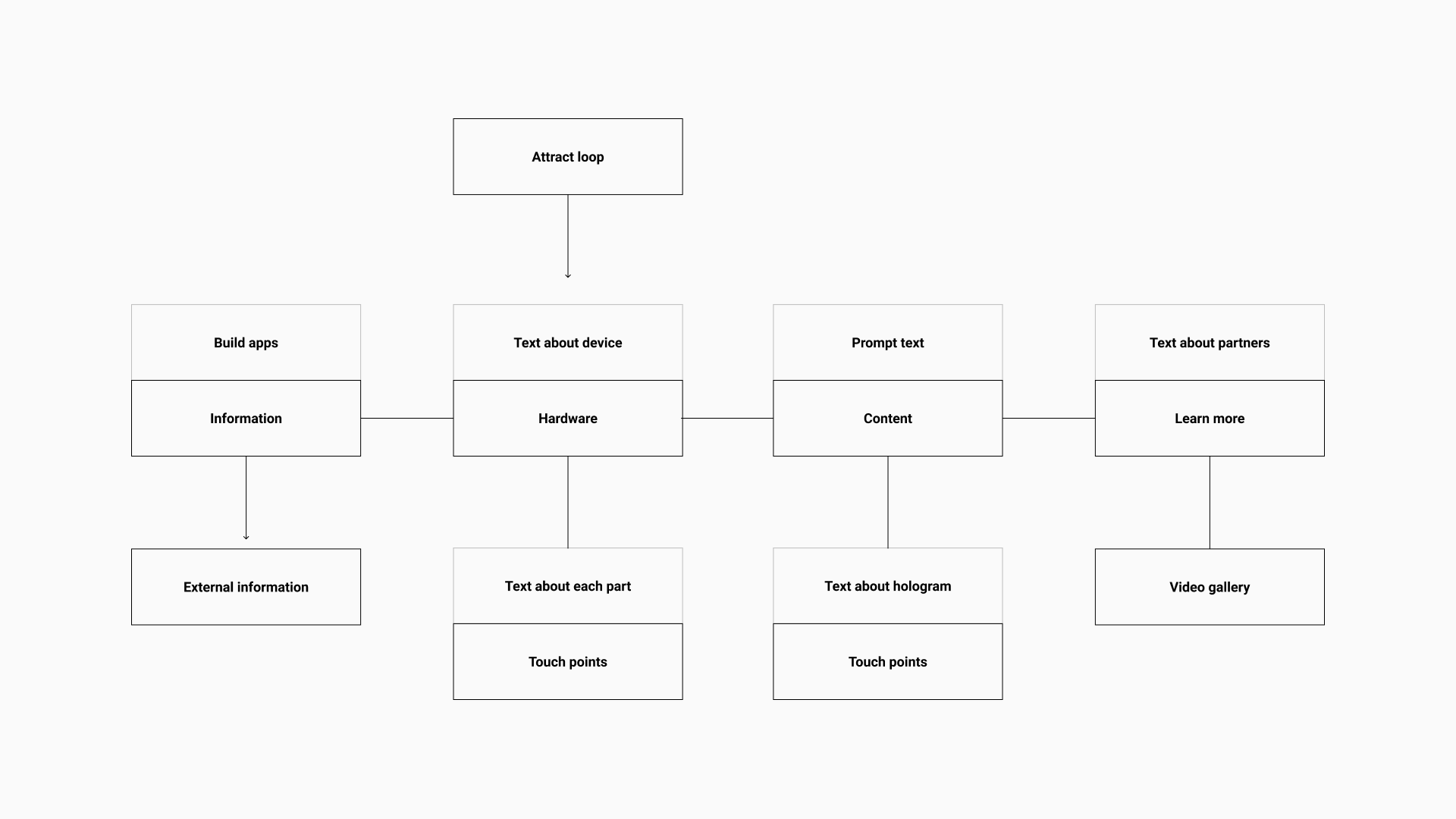
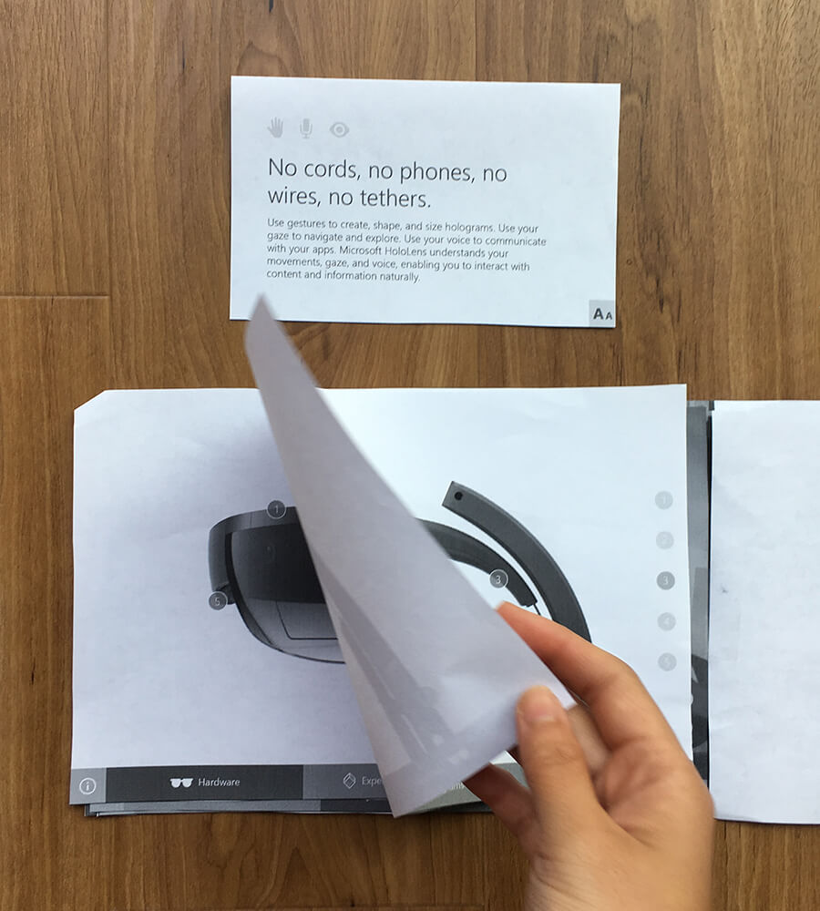
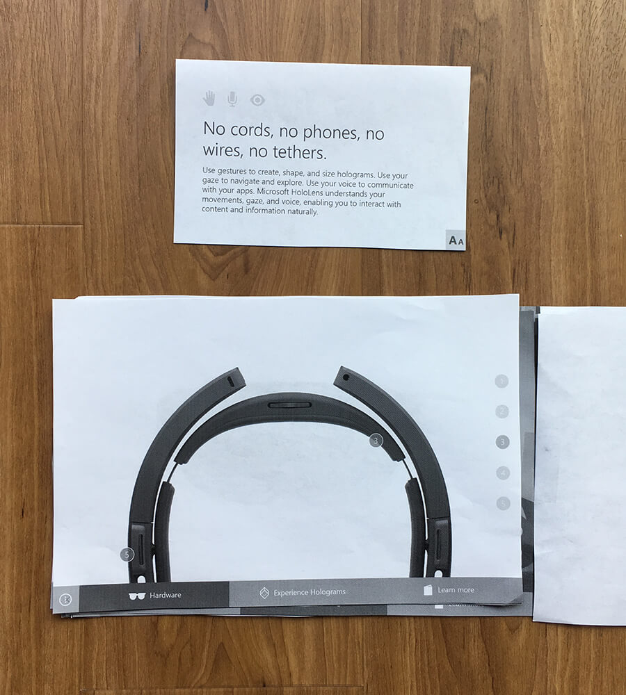
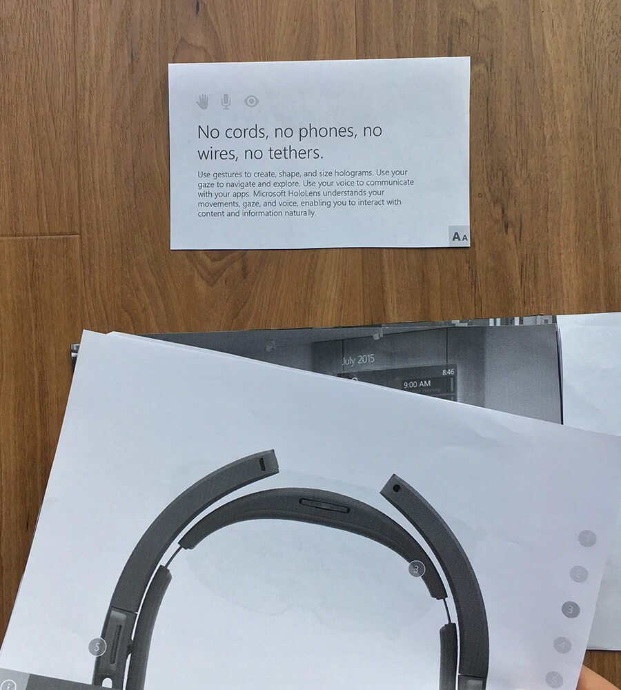
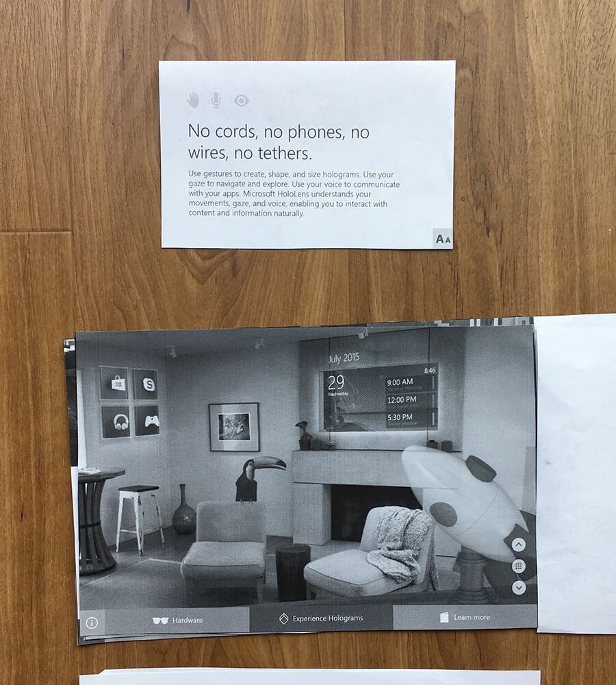
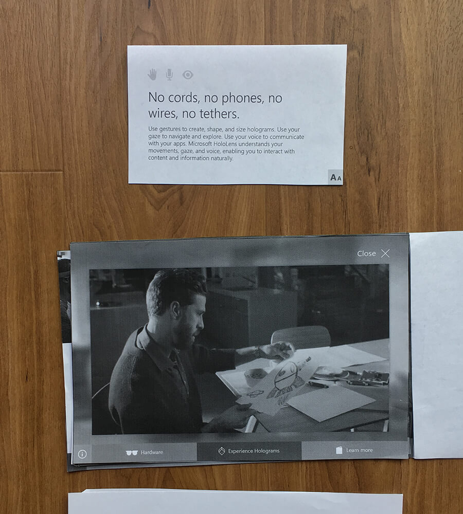
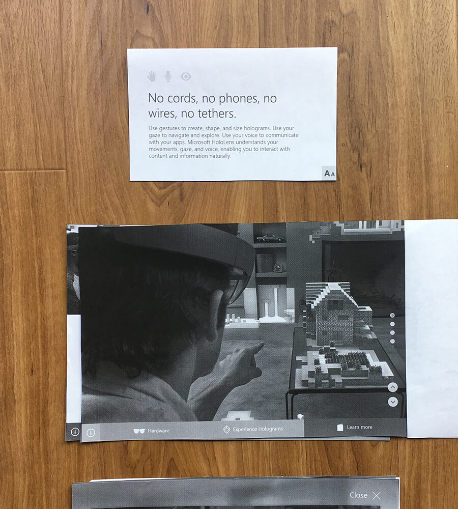
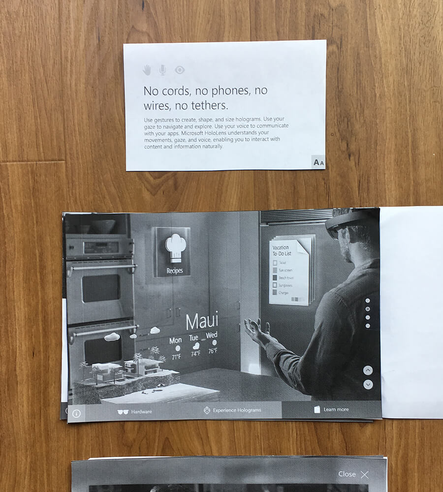
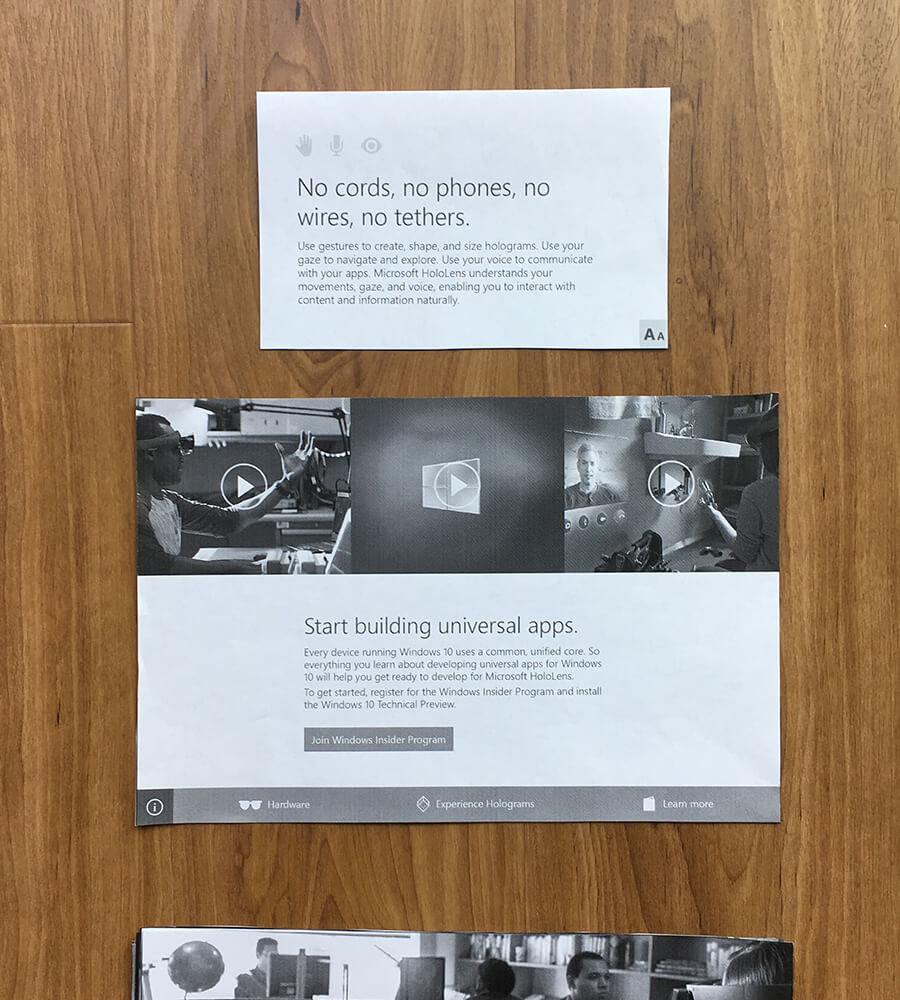
We made a paper prototype to test the simultaneous use of a top and bottom screen. The main takeaway from this test that was it’s really hard to switch your focus from a bottom screen to a top screen.
REMOVING THE SECONDARY SCREEN
After showing a few variations of what would be possible on the top screen, the clients decided it was time to scrap the secondary screen. The use of it could not achieve what was initially imagined when the project first kicked off.
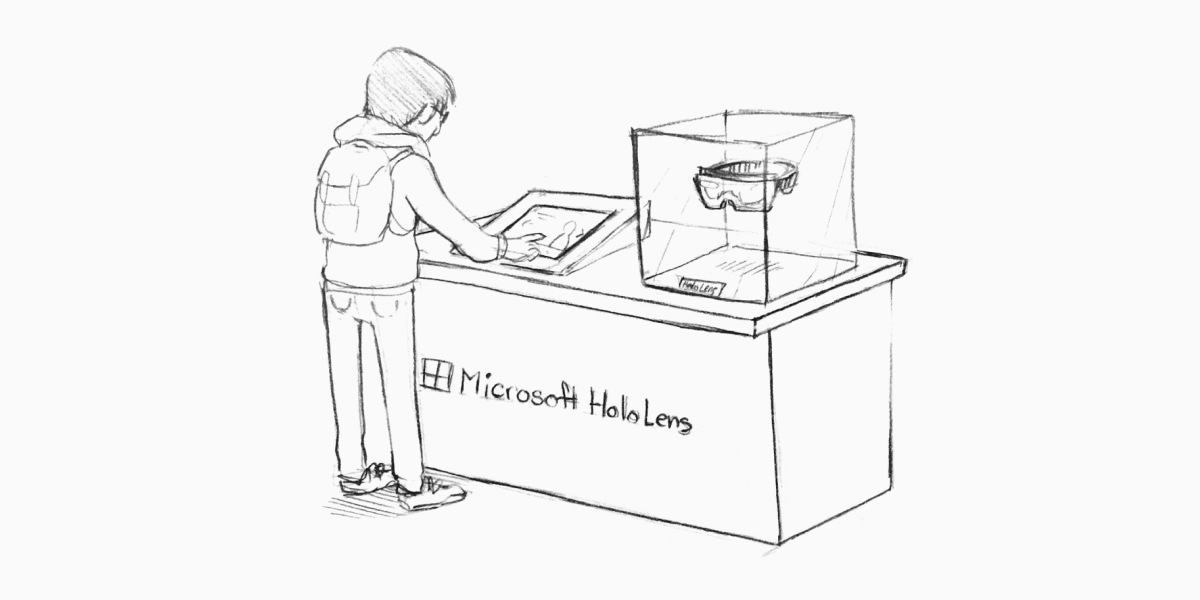
ADJUSTING THE FLOW
I re-drew the set up so I could have a visual to glance at while updating the flow and designs.
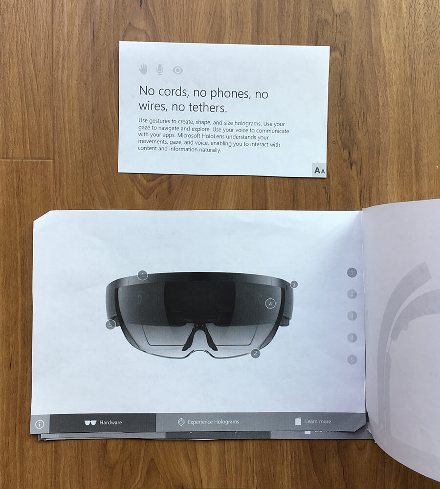
Between myself, my art director, and another designer, we changed the flow of the experience to incorporate text and while also aligning it to HoloLen’s newly released marketing pillars. The older flow focused on showcasing the hardware first and then the holograms.
The new flow starts on an overview page which captures the essence of HoloLens at a glance and then it breaks into: Holograms, How to use, Technology, and updates.
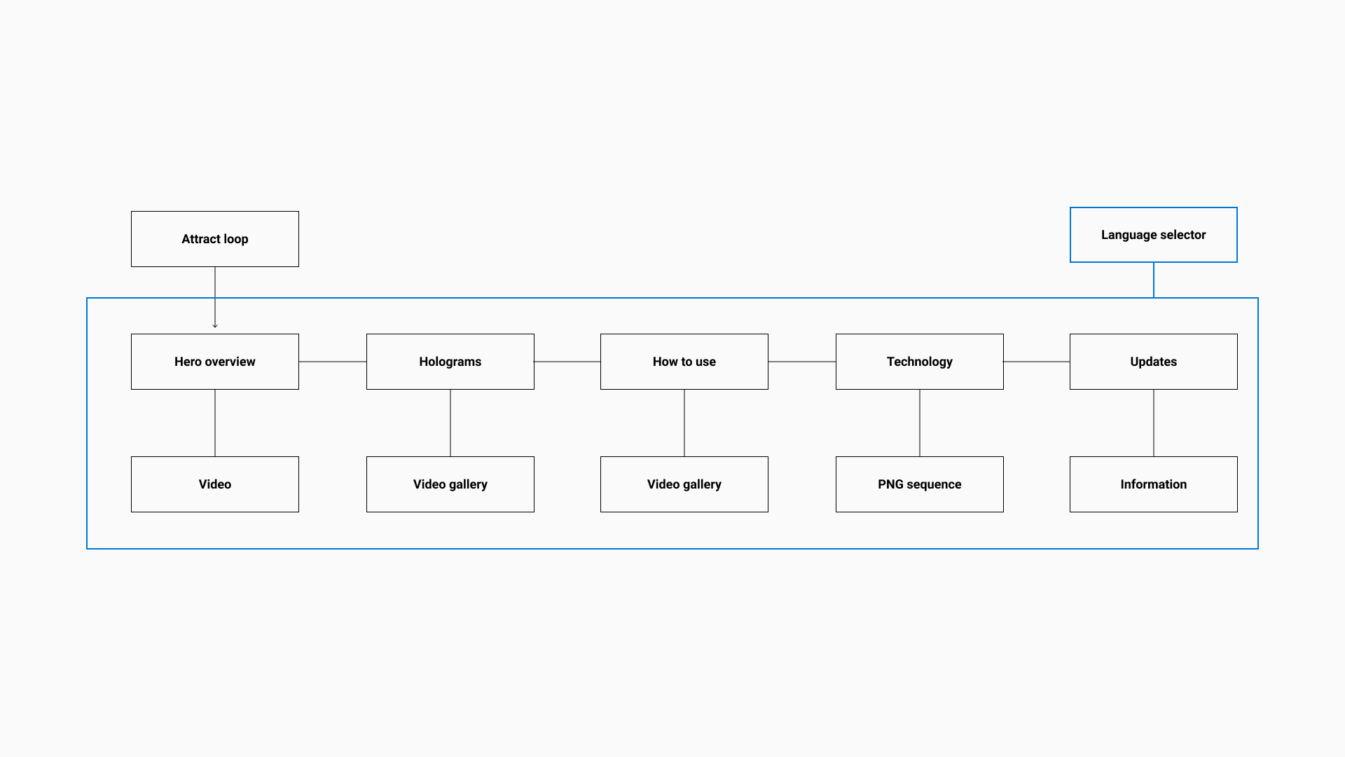
BASE WIREFRAMES
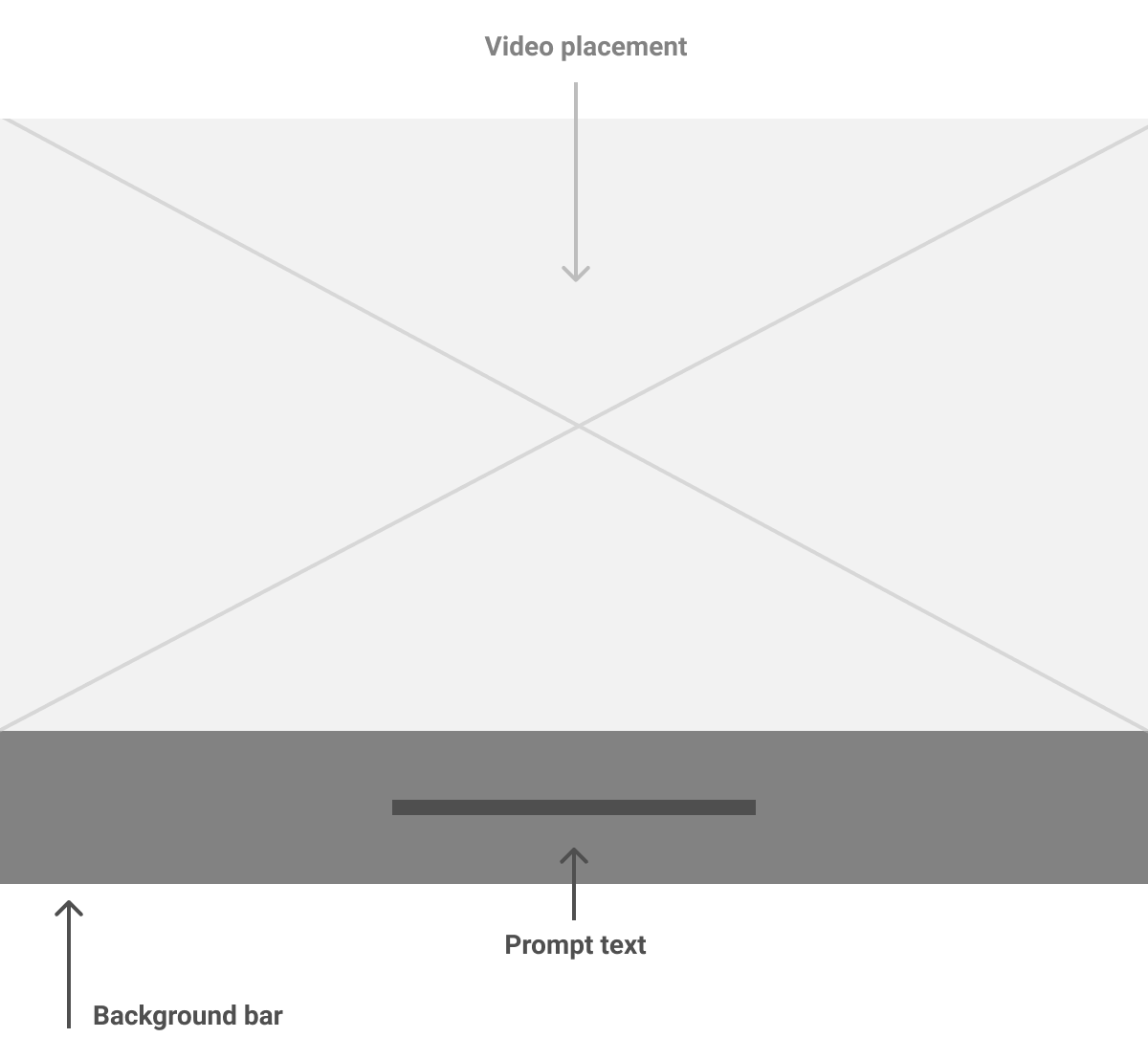
Attract loop
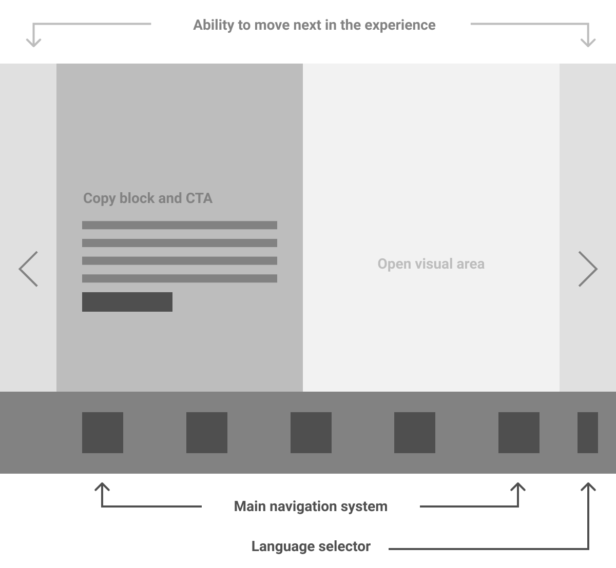
Main sections
SECONDARY PAGE WIREFRAMES
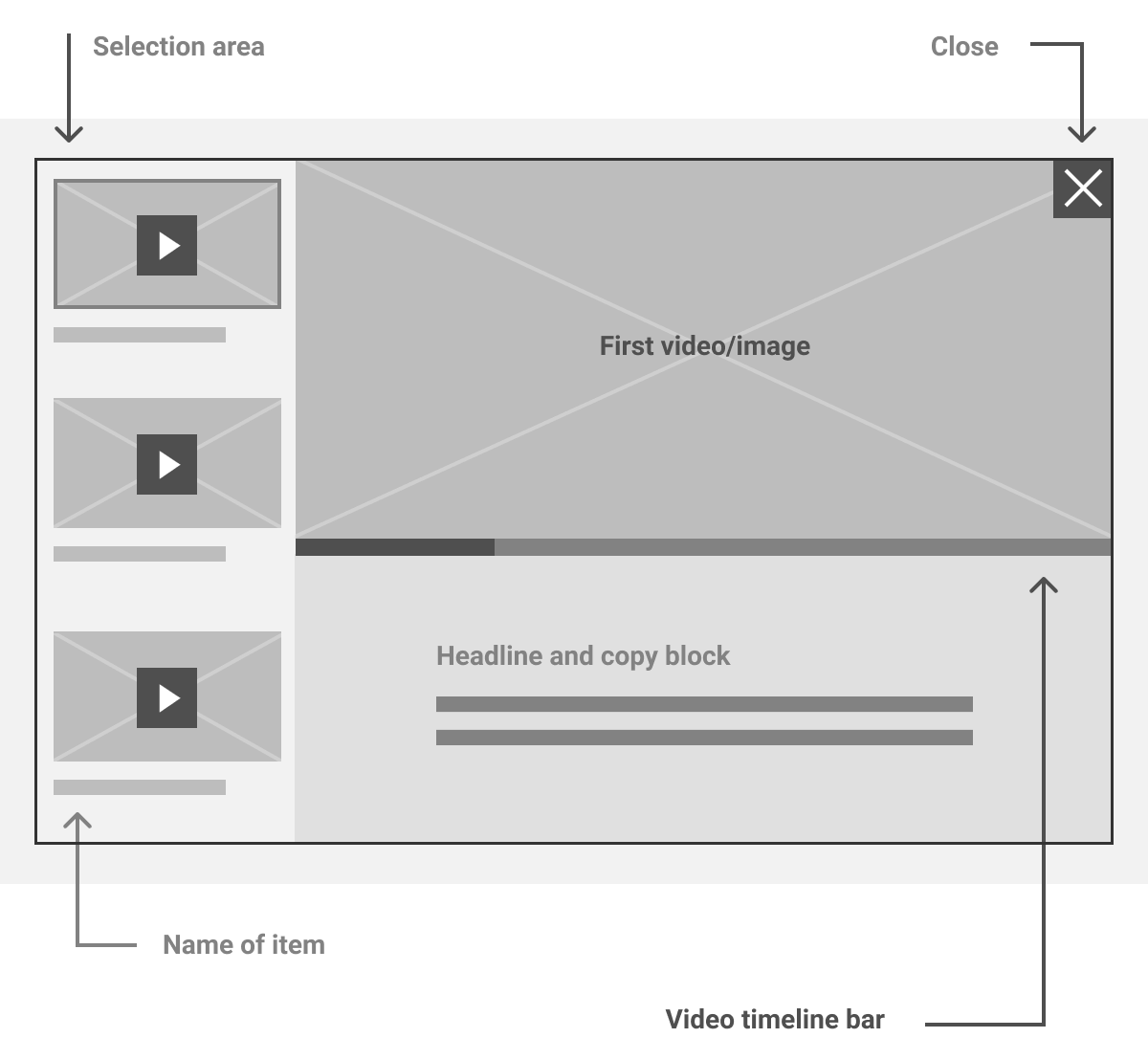
Gallery
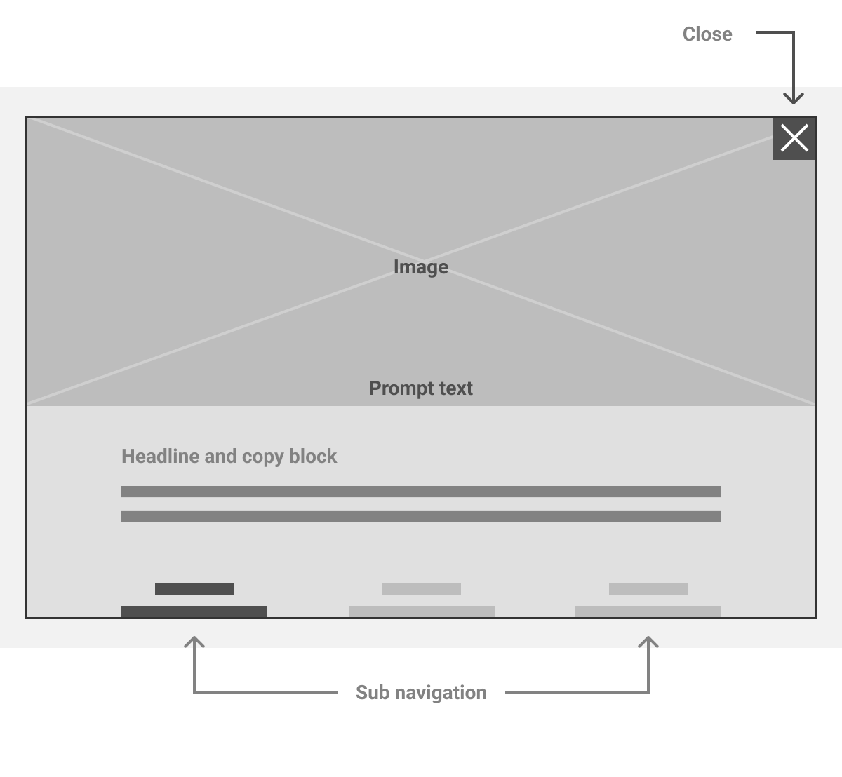
PNG sequence
For this experience, we needed an attract loop that kept moving to attract the attention of customers passing by. I edited together approved content for the attract loop.
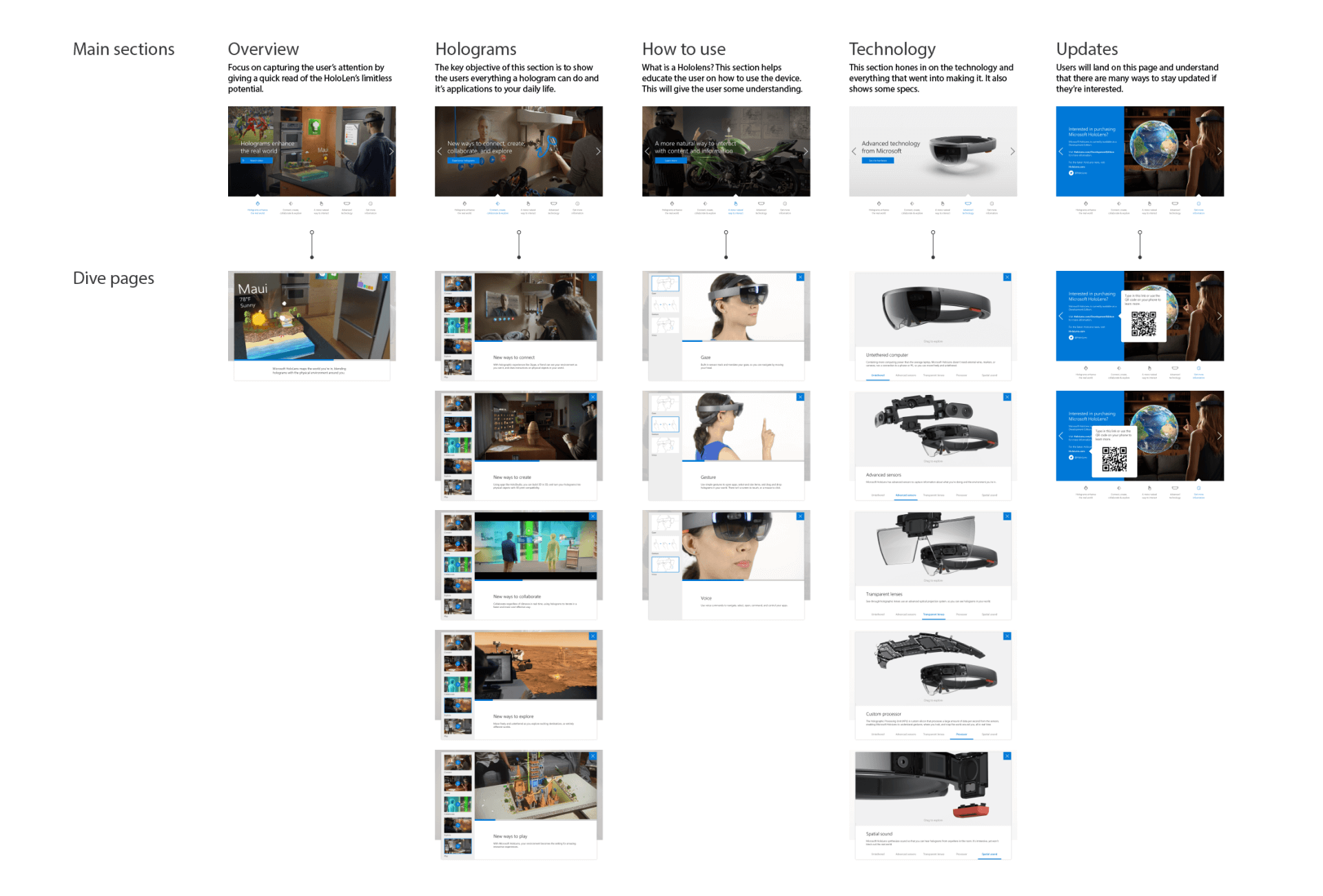
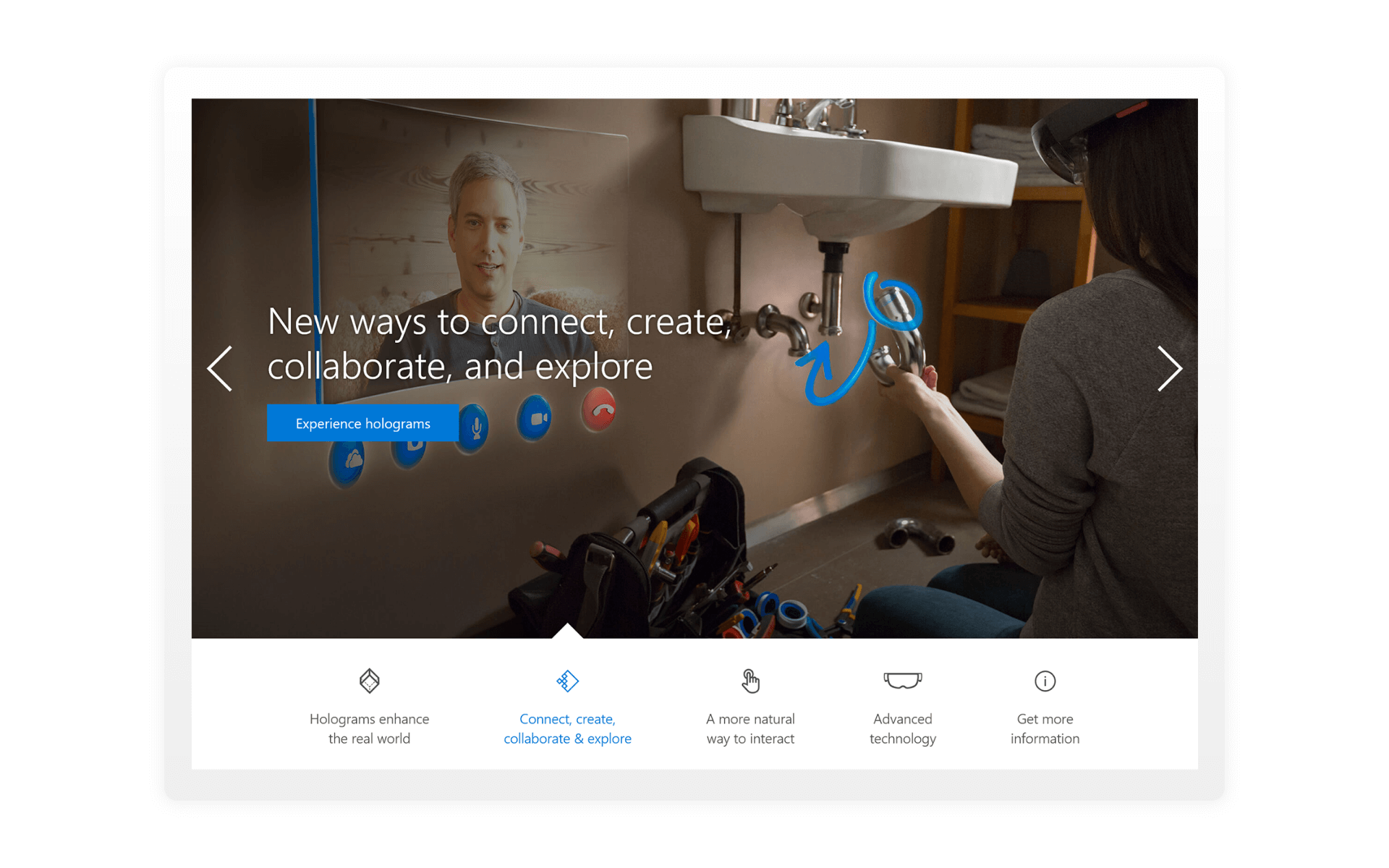
Breakdown of main pages and their dive pages with the final designed pages. The experience was set up so that the customer can learn everything they need from the main 5 pages. The first three main pages contains a looping cinemagraph.
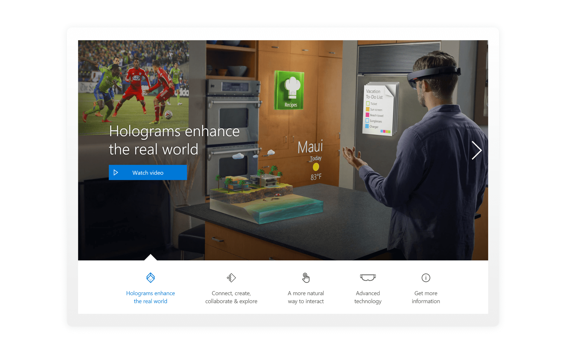
1. OVERVIEW
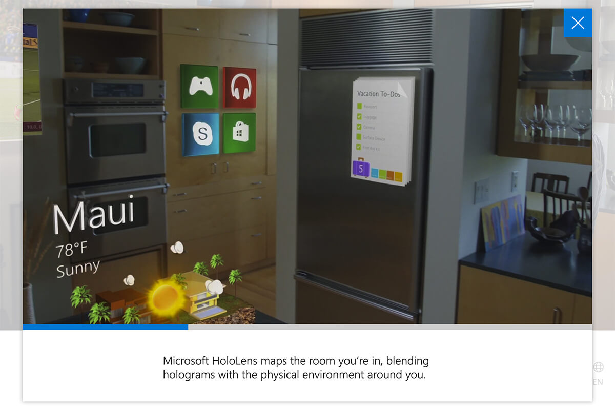
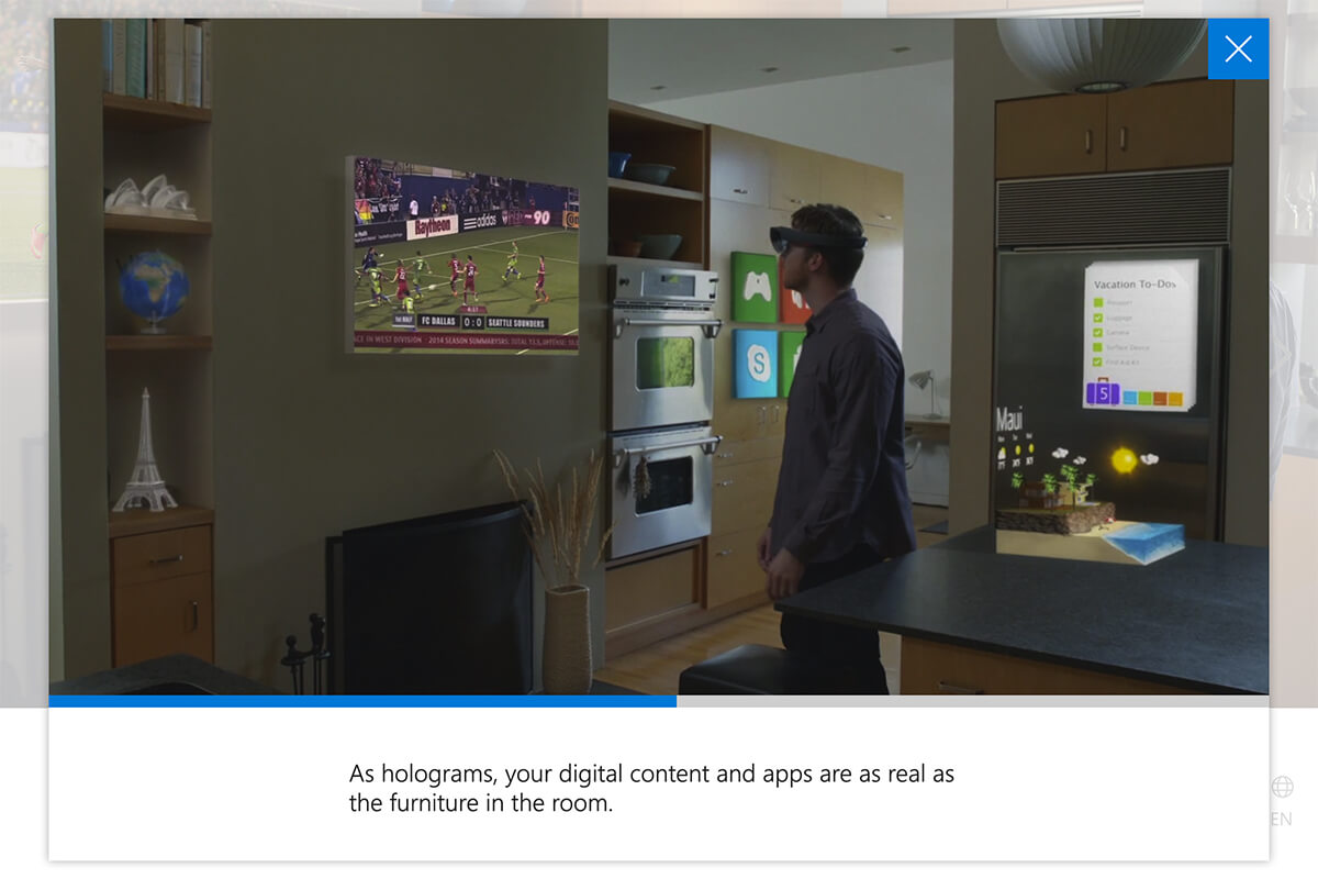
The watch video call to action launches a pop up, the video that plays has a time indicator and it also has copy that changes with the scene to highlight a section.
2. HOLOGRAMS
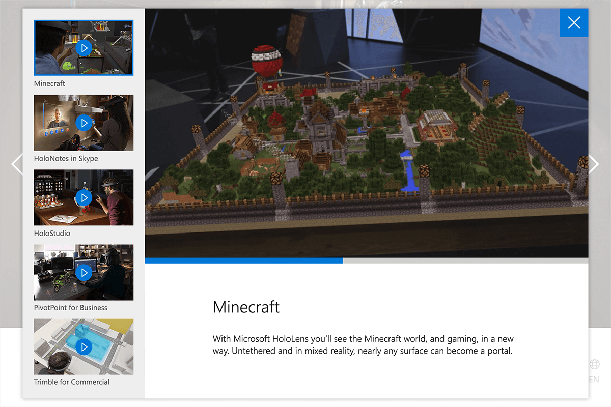
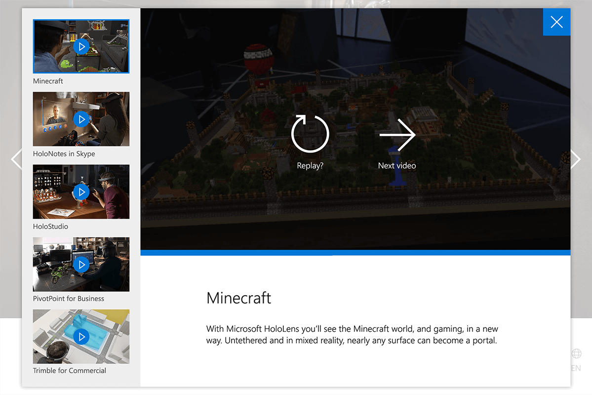
A video gallery launches from the 2nd screen, the current video that’s playing will have a blue outline on the side panel. After the video complete, there’s an option to rewatch it or it continue to the next video to keep users moving forward in the experience.
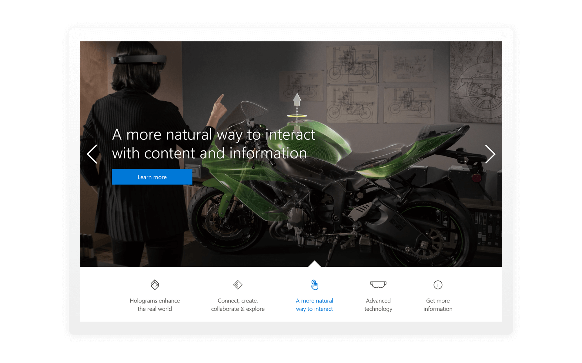
3. HOW TO USE
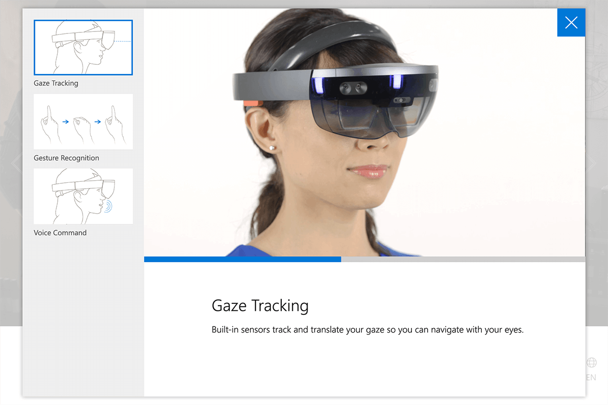
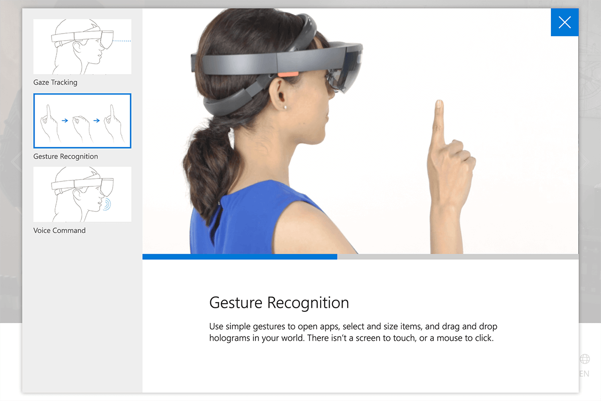
New technology is scary, this section is all about letting people know how to use the HoloLens. We used illustrations for the thumbnails on the gallery to have a s stronger immediate read.
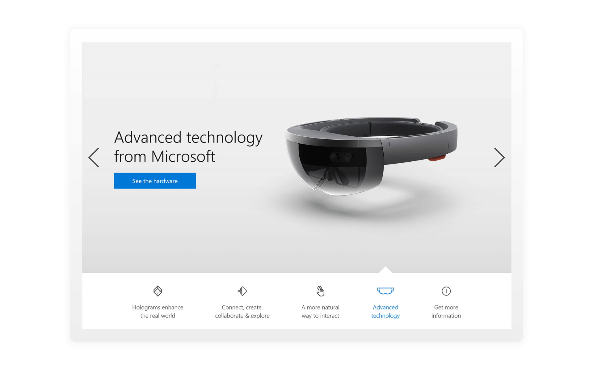
4. TECHNOLOGY
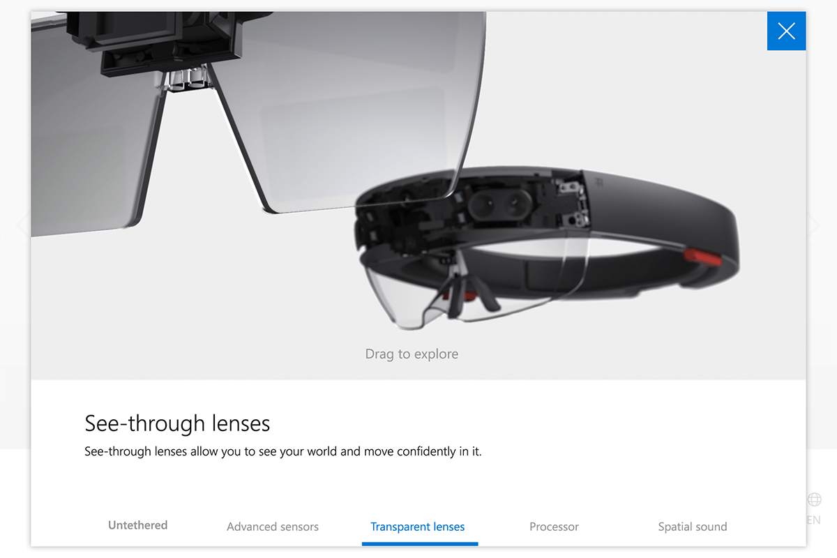
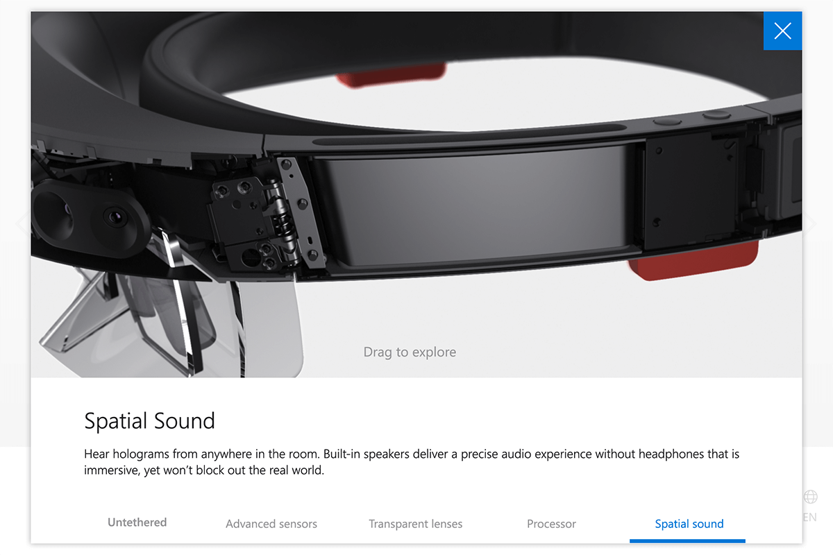
The technology section contains a PNG sequence that customers can play with to see what makes up the hardware. Users can touch and drag on the hardware to make the PNG sequence animate or they can touch the bottom items to have the PNG sequence animate to the spot where the content is relevant to the text.
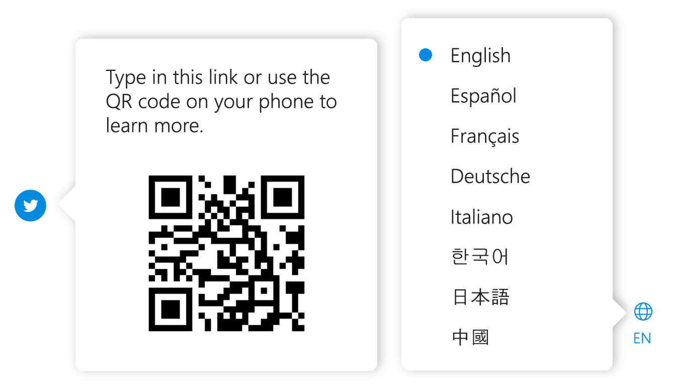
I styled the smaller pop ups to have little pointer pieces like the main navigation. On the language selector, we placed a blue dot to help the user know what language is currently active.
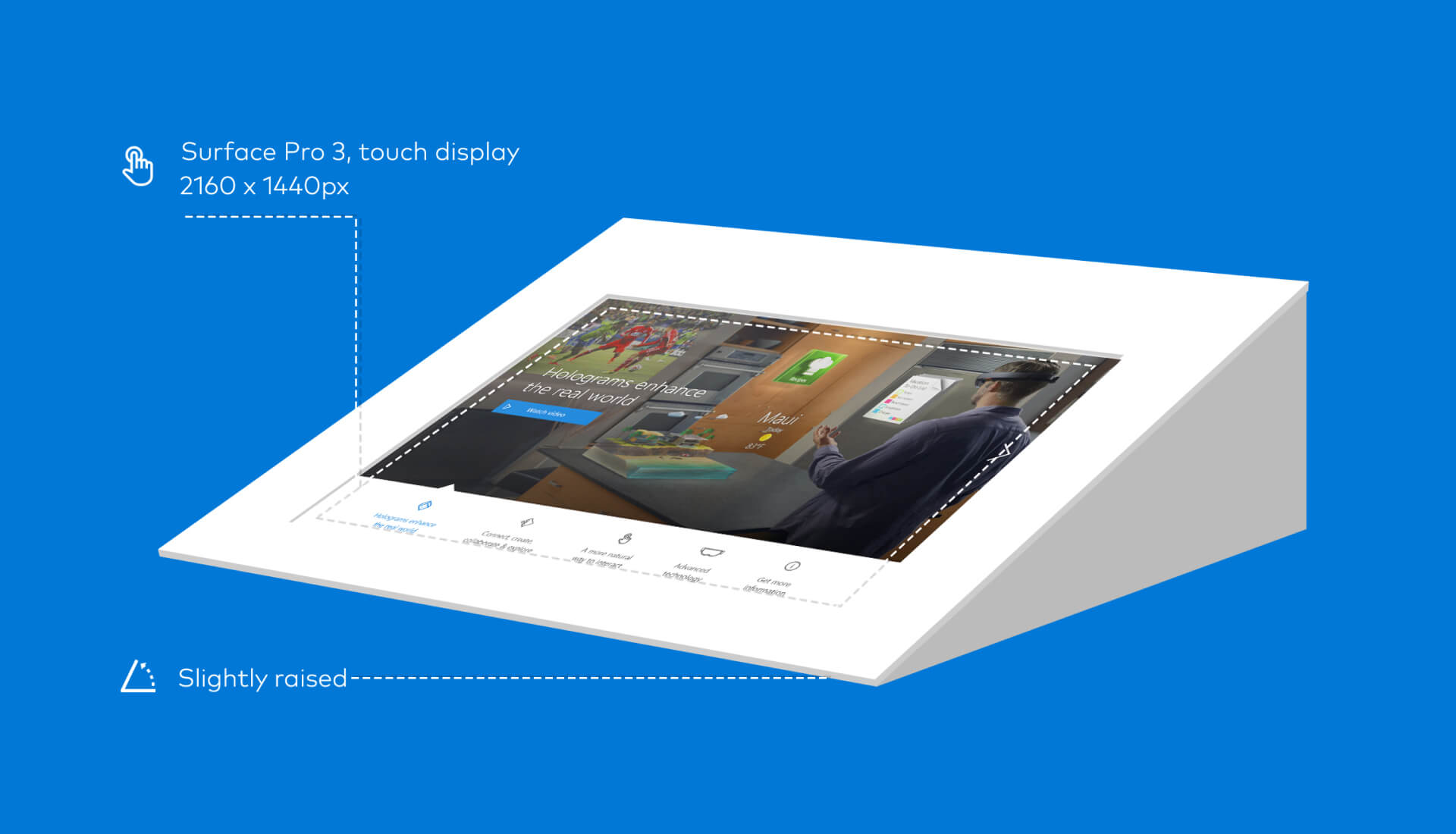
DESIGN TO DEVELOPMENT
I created spec sheets for the developer working on this experience. My main goal was to remove any unnecessary guess work from type styling, colors used, and placement of images.
The excel sheet I made also doubled as a way for me to keep track of what assets we’ve made already or which ones we still needed to get from our client.
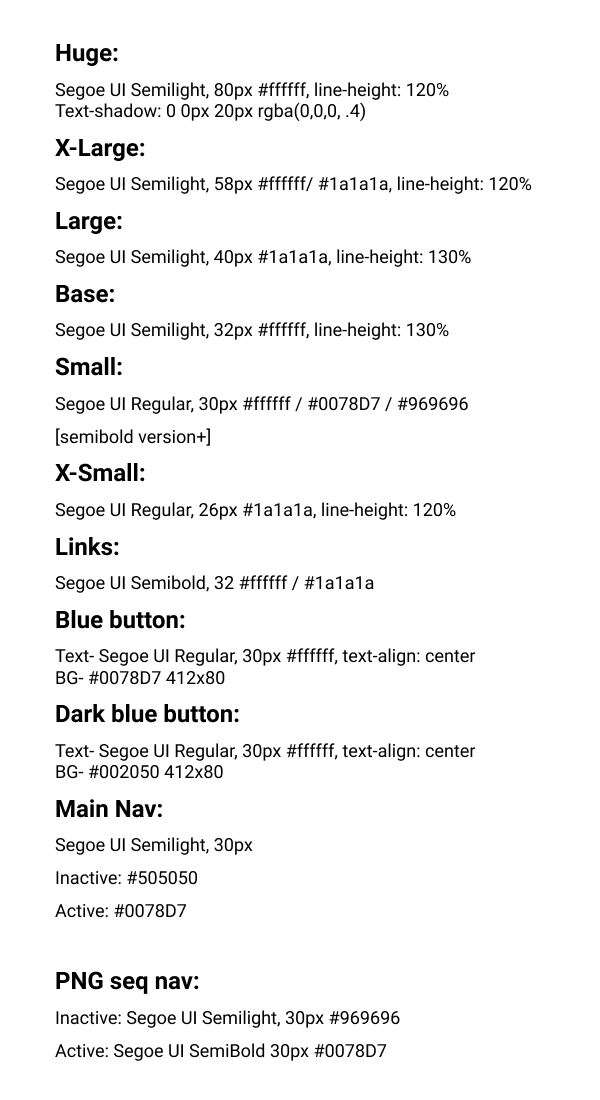
Style sheet
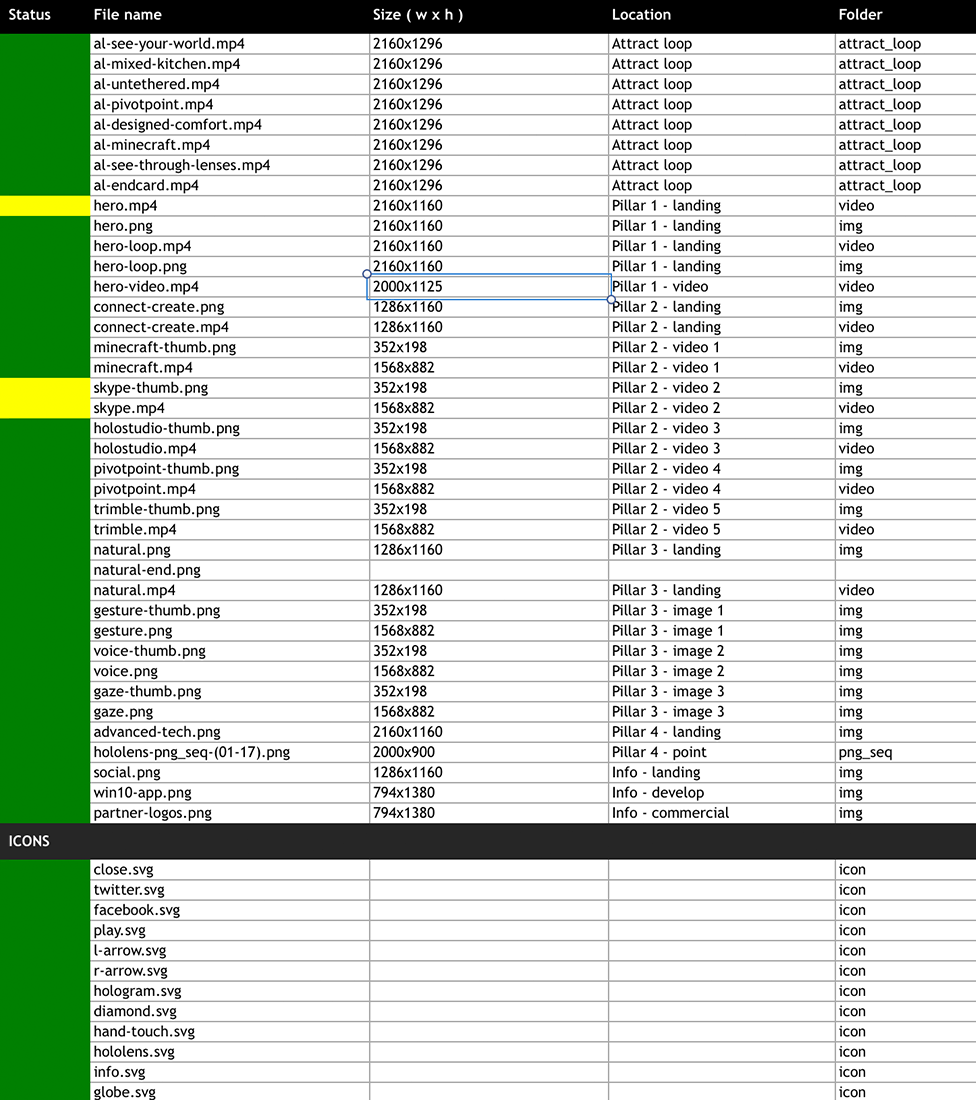
Asset sheet
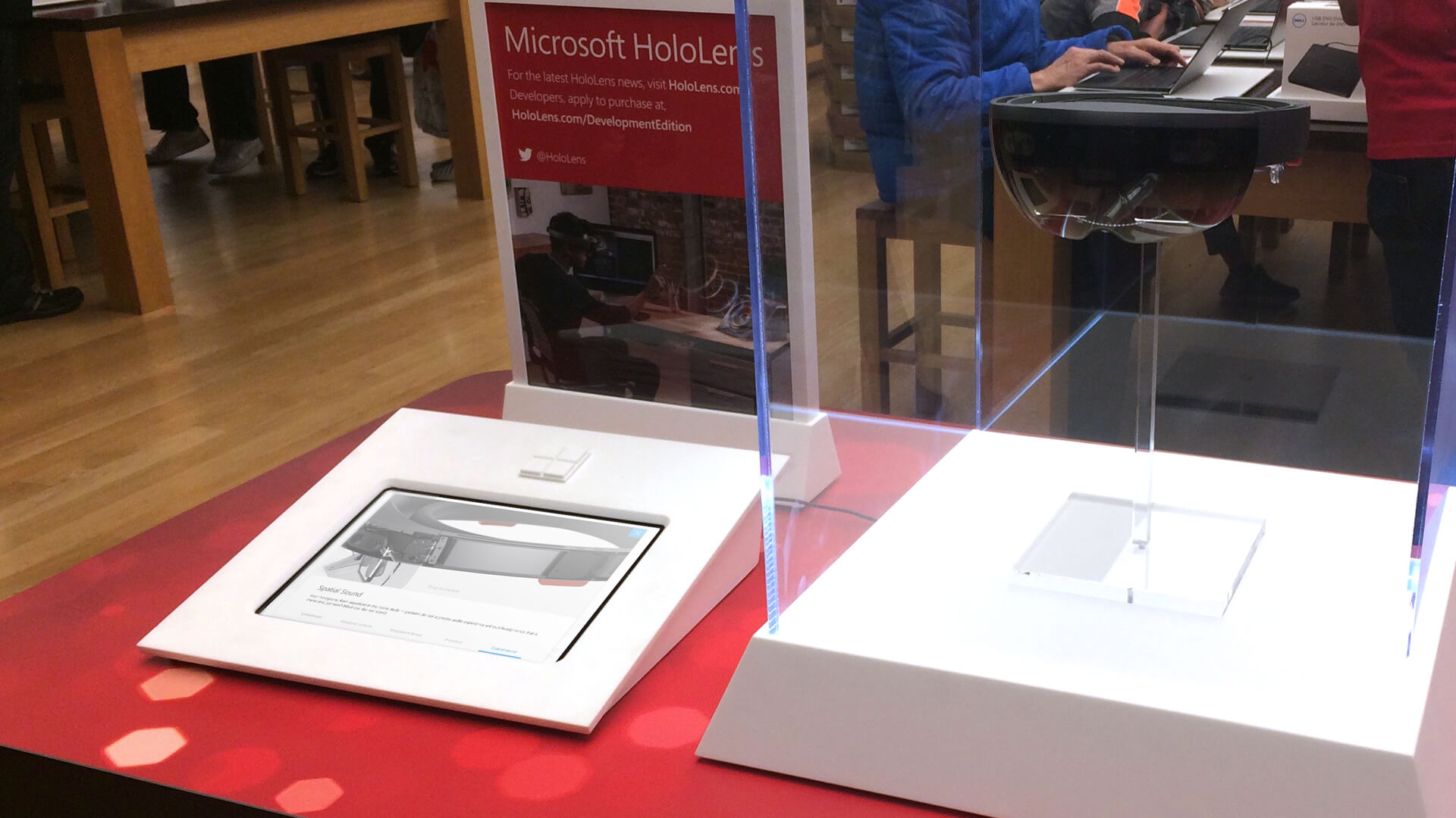
Final experience photo.