THE PROCESS
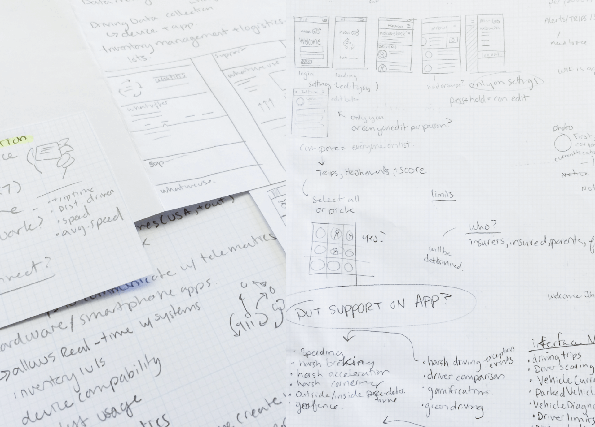
I started with researching about Modus Go and breaking down the information associated with the tracker so I could make informed decisions on adjusting the flow if needed.
On a team at Ten Gun Design, we worked with Modus to update their app design and flow. Modus Go is a tracker that you place into your car to gather information on driving patterns & behaviors to help lower insurance prices and rates for families. The app is a way for people to keep track of their information.
Special thanks to Tim Harding for the phone renders used in the top image and art direction by Ryan Burlinson.
UX / UI designer
I started with researching about Modus Go and breaking down the information associated with the tracker so I could make informed decisions on adjusting the flow if needed.
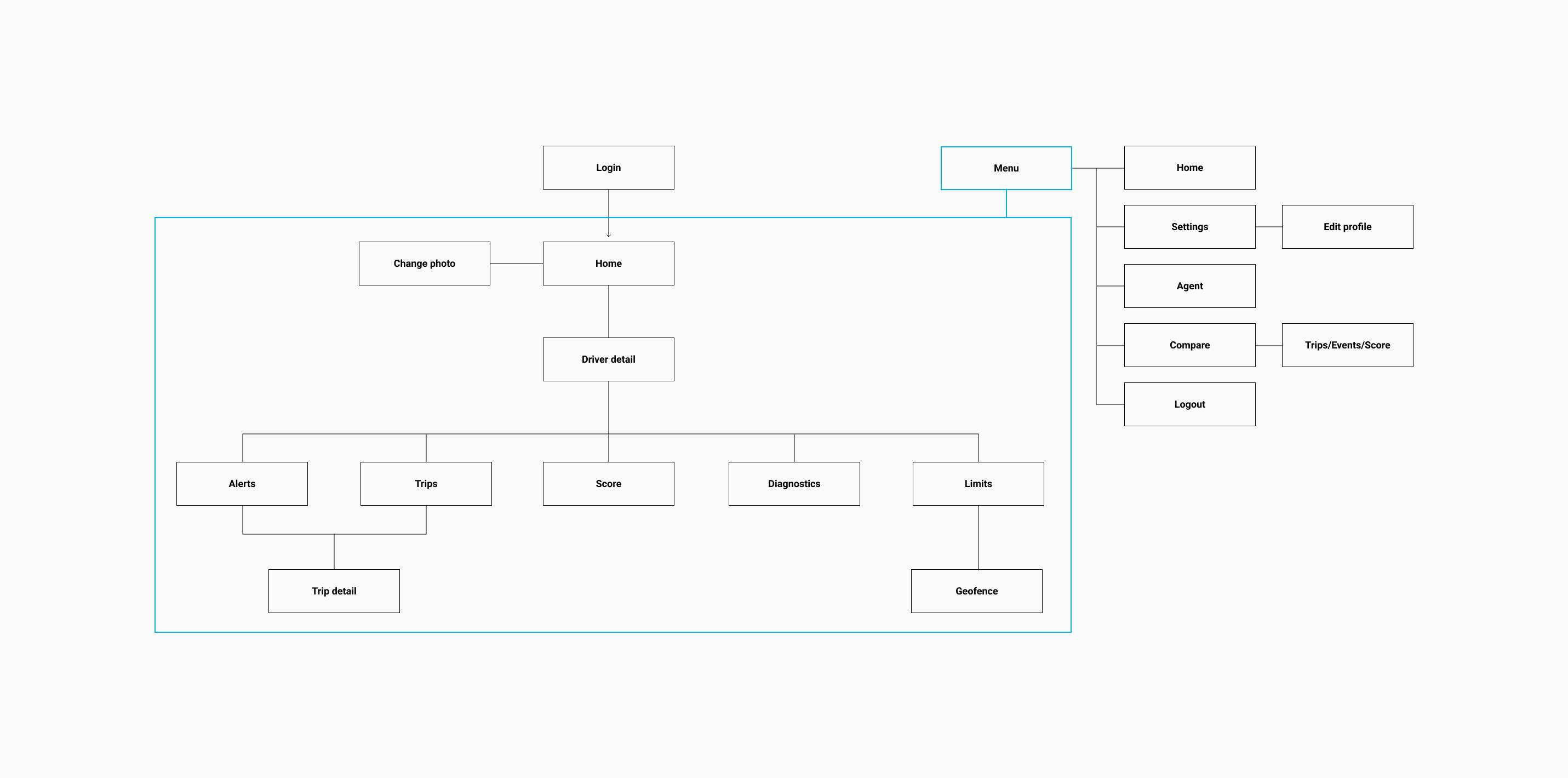
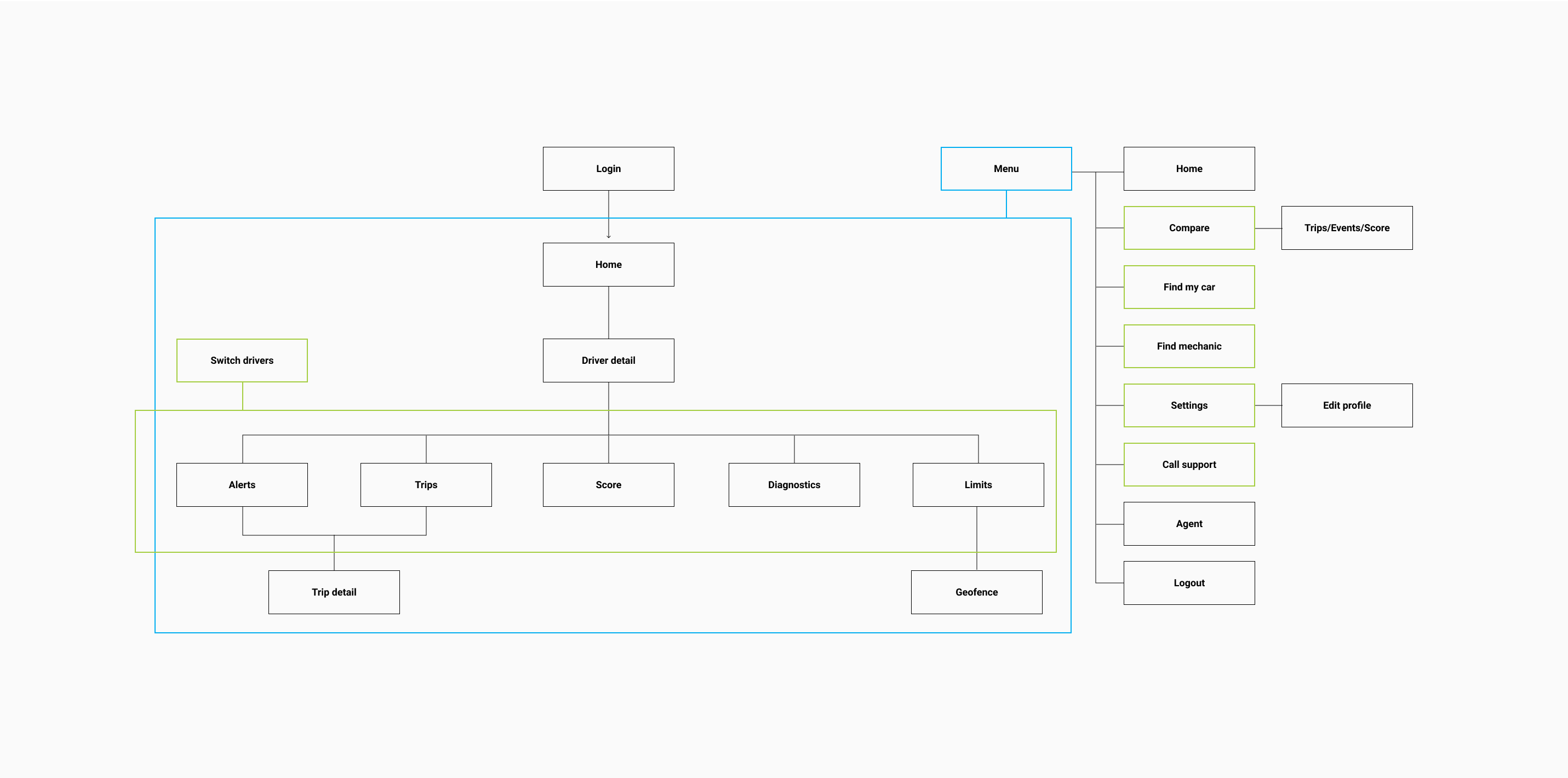
I noticed that anyone using the app had to return to the home screen if they wanted to view a different driver’s score, trips, and so on. This lead to adding in the ability to switch drivers on the secondary screens.
Find my car, find mechanic, and call support were added to the menu, I reordered the menu to have the top containing actionable items and the bottom to contain external items.
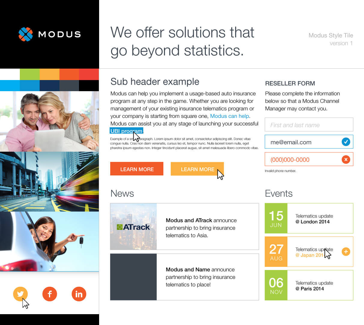
The app at the time looked outdated due to the colors, sizing of icons, and typography. Modus Go wanted us to adjust their app design to match the style of their website.
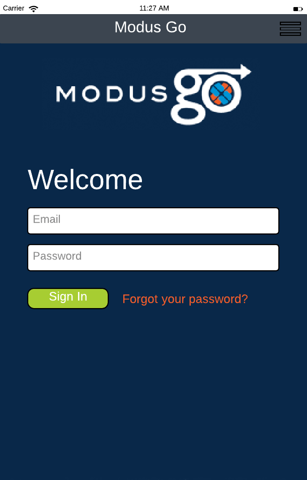
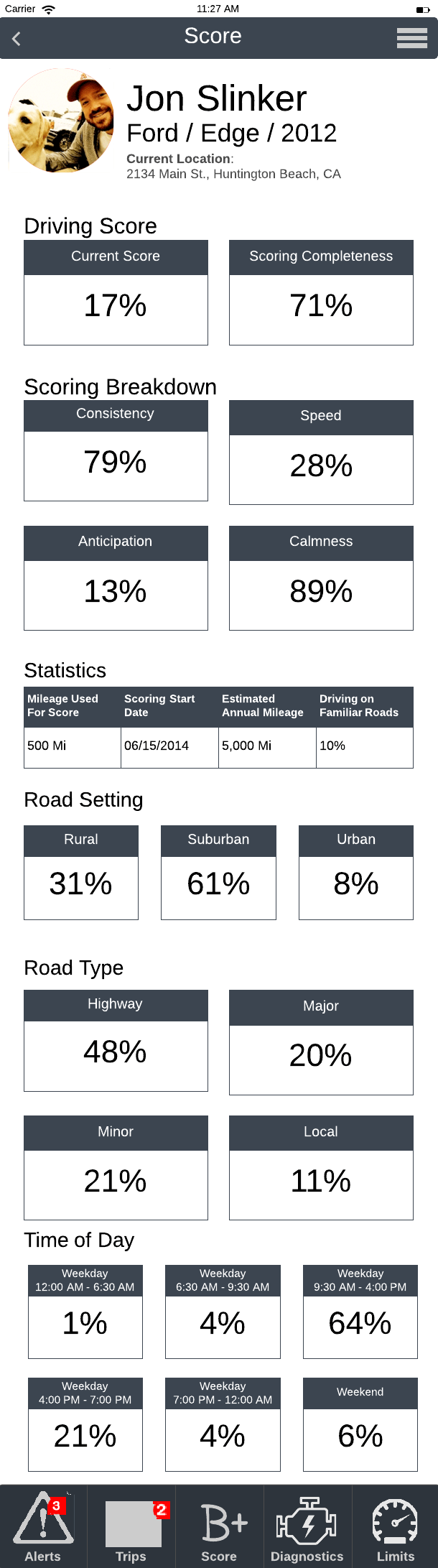
Old
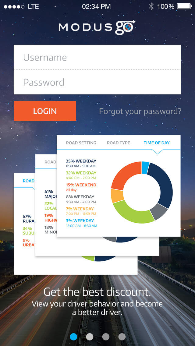
New
I increased the size of the form fields and login button. Visuals were added to showcase updates and features in the app.
Old
New
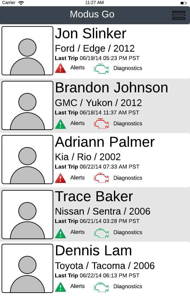
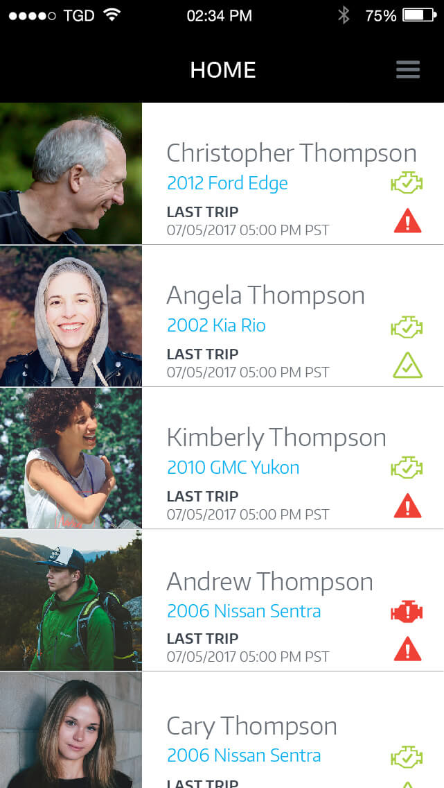
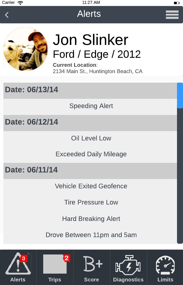
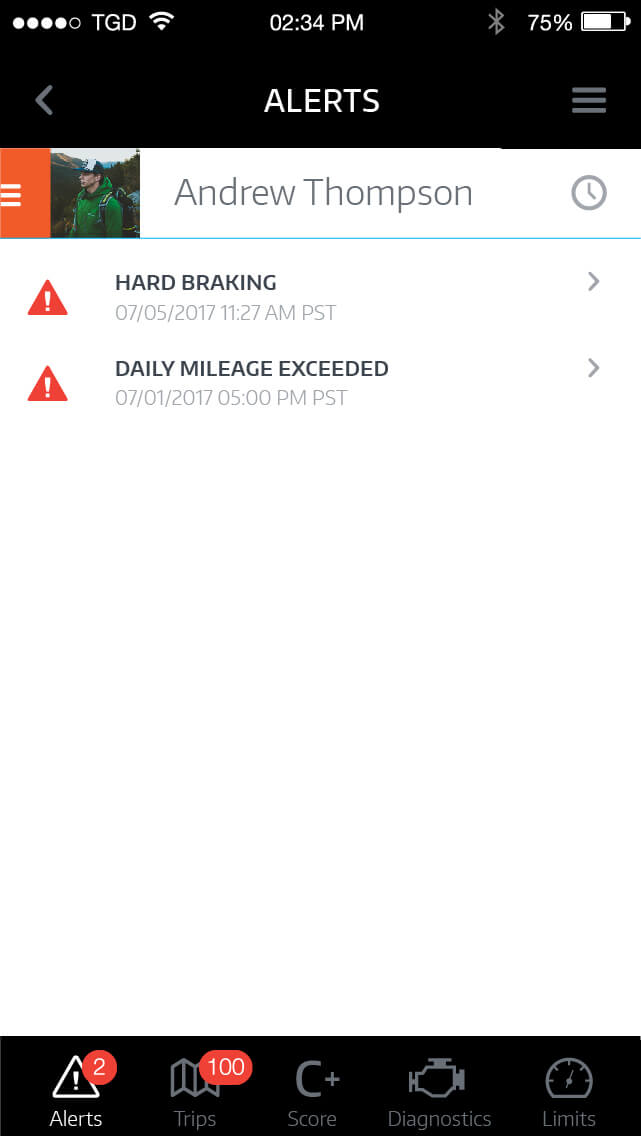
I modified the typography to a more comfortable size and adjusted the alerts/diagnostics icons visually. The icons were moved to the side so people can quickly scan to see if there are alerts/issues.
Old
New
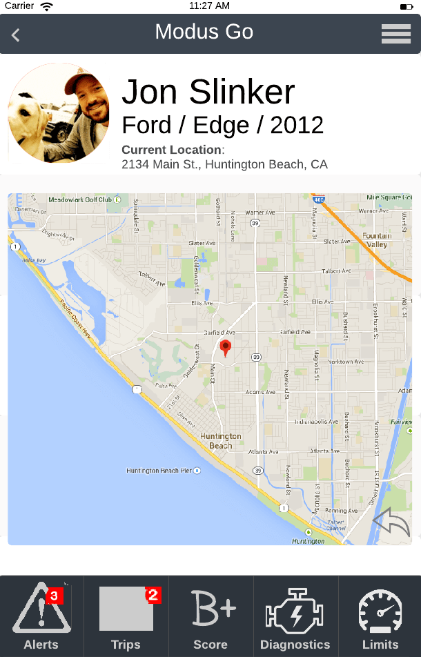
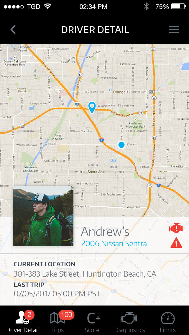
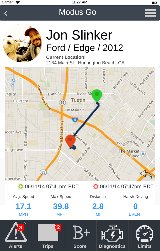
I reduced the bottom bar in height to feel less cramped and created some new icons. The driver information was moved to the bottom to create a bigger space to show where the person is in proximity to their car location.
These are the icons I created for the app, they needed to match the primary icon set we were using on the app. At the time Entypo was being used.
Example animations to demonstrate the look and feel of the switch driver side panel, geofence, and compare data.
Animation by Brandon Korvas and phone render by Tim Harding.
Old
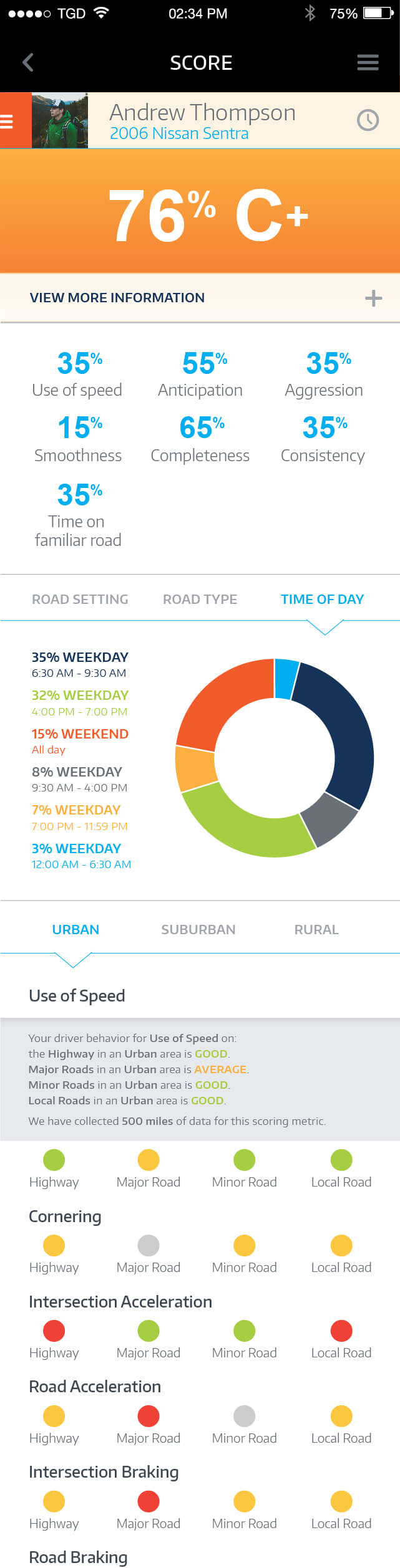
New
I cleaned up the list and created a compact view of the driver. To switch between drivers, I used the drawer icon and cropped it on the side to make it visually say “there’s more” on the side.
Old
New
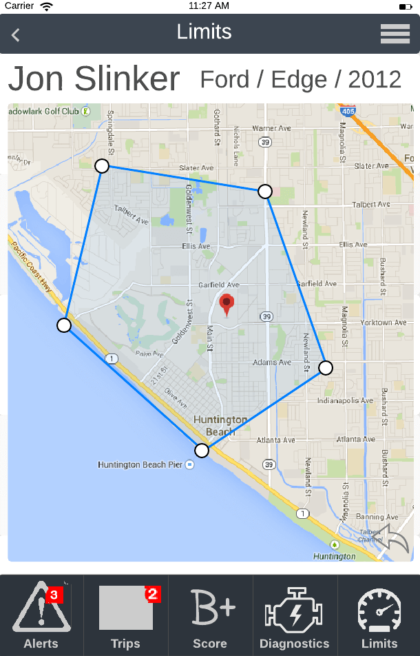
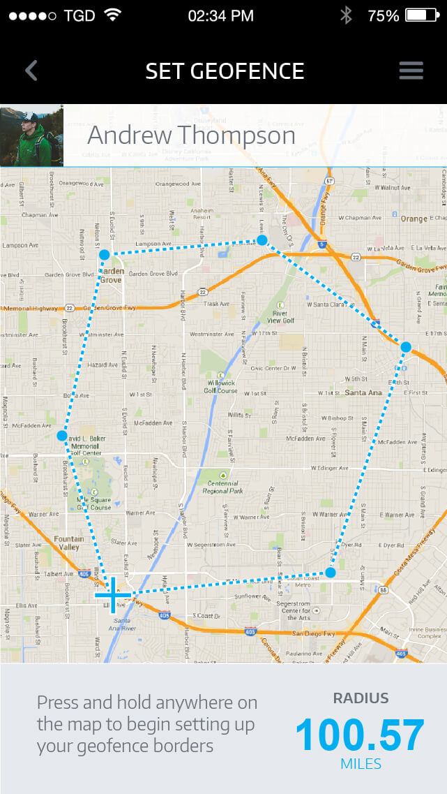
I removed the navigation bar at the bottom on this screen in order to solely focus on creating the geofence. I used the bottom space for verbal instructions and radius total.
Old
New
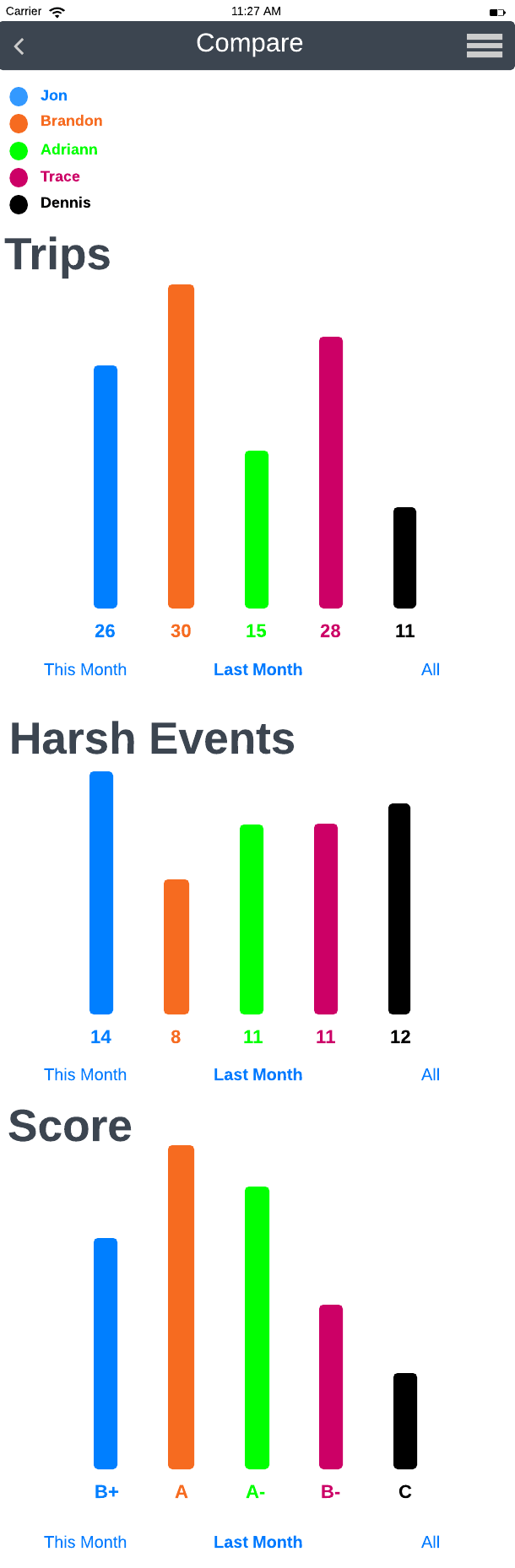
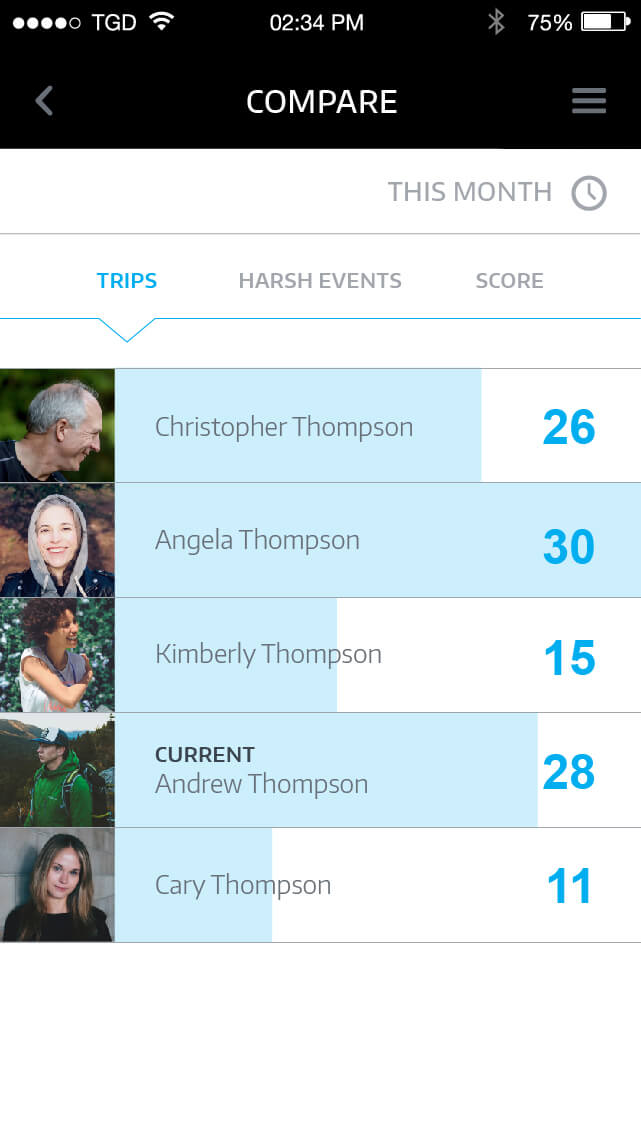
I simplified their compare page by adding in tabs to jump between the main sections: trips, harsh events, and score. It was hard to match colors to people when comparing, so I carried the profile images into the design.
Old
New
After scrolling
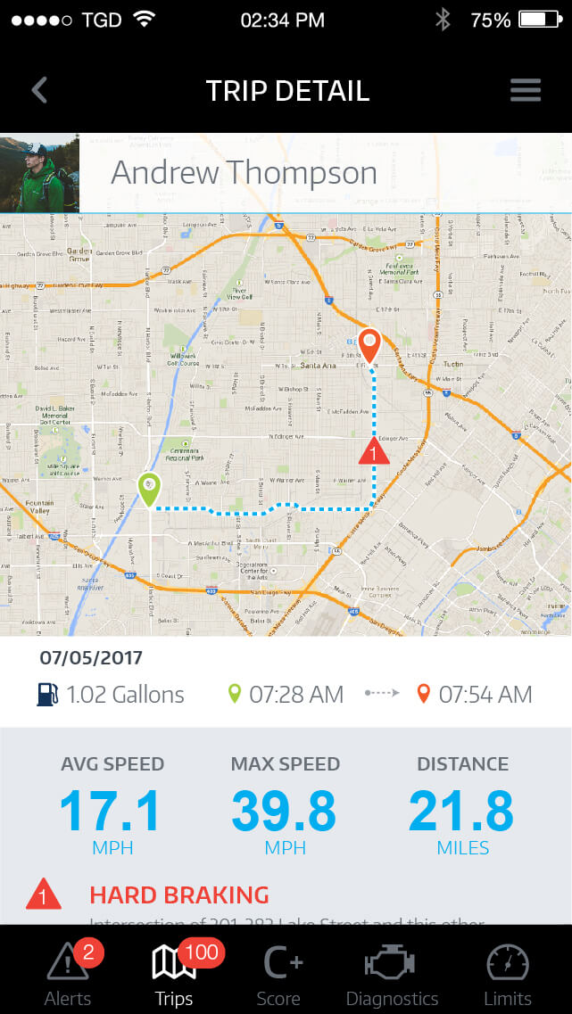
From the start and stop points, I pulled the date to reduce the read to only contain time. I added in gallons used per trip and made the read larger on the numbers for average speed, max speed, and distance. Additionally, whenever someone scrolls in the app, the navigation bar slides down until they scroll back up or taps near the bottom to reveal it again.
Old
New
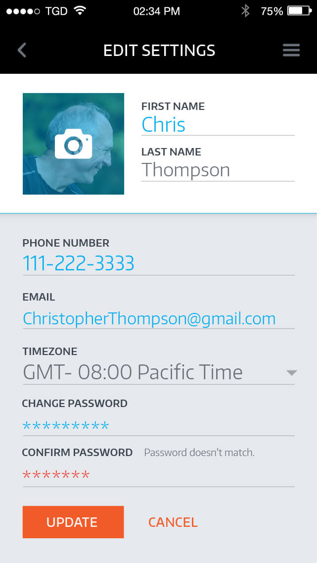
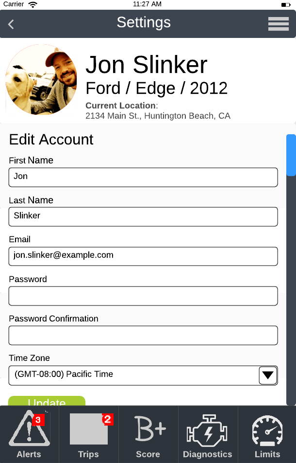
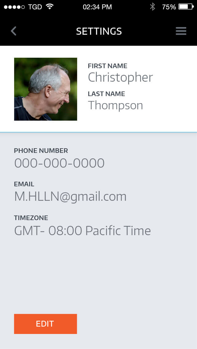
Editable fields
I changed the flow of this page by adding in the edit button. I wanted to make the edit more intentional, people would have to look first to see if there's a need. On the editable page, the fields turn to visually look active and change password appears.
Old
New
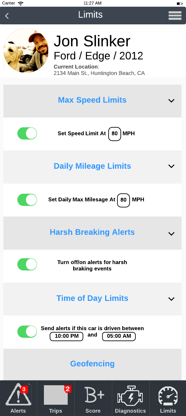
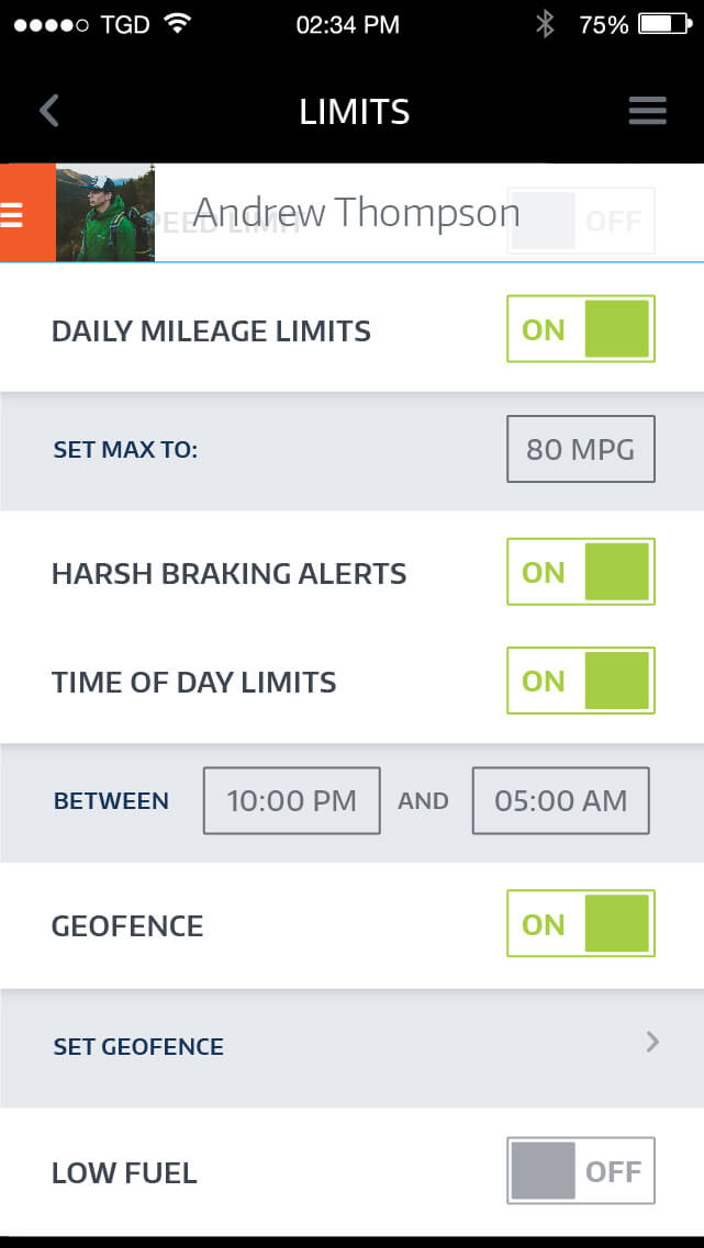
I standardized the on/off toggles by moving it to the right, both iPhones and Androids have the toggles on the right on their settings page. I removed the accordions and added in a secondary tier for options under certain items.
Old
New
I broke down their information and added graphs and colors. The biggest value is the drivers score, which is graded from A-F. I used a gradient from green to yellow, to orange, and then to red to indicate how well someone's score is faring. The graph area is swipe-able and shows percentages.
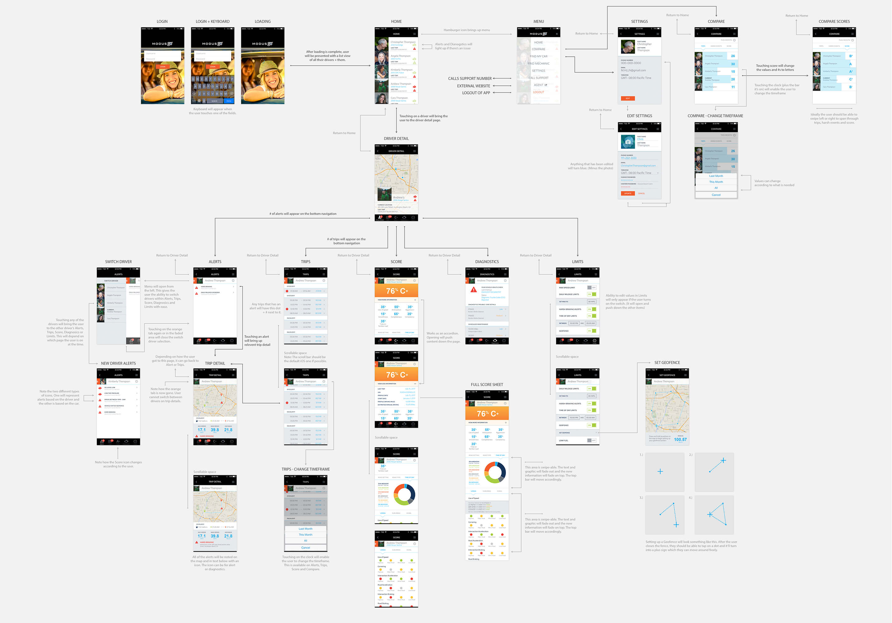
Final designs with the flow diagramed.
An example of how a recall notification would function to keep a family safe and alerted.
Animation by Brandon Korvas and phone render by Tim Harding.